Vermillion Insights
March 19, 2026 · Ken Vermeille · 21 min read
Unlocking Growth with Mobile App Retention Metrics
Discover the mobile app retention metrics that directly fuel MRR growth. This founder's guide offers actionable strategies to track, analyze, and improve them.
Mobile app retention metrics are the KPIs that track how many users stick around after they've installed your app. For any subscription business, these numbers are everything. Even tiny gains in retention can have a massive impact on your Monthly Recurring Revenue (MRR).
Why Your App's Growth Depends on Retention

Let's be honest: acquiring new users feels great, but for a subscription app, it’s only half the story. The harsh reality most founders face is the "leaky bucket" - a steep cliff where user engagement plummets right after installation. You spend a fortune pouring users into your app, but poor retention creates a massive hole that silently drains your growth and revenue.
And this isn't just a small drip. It's a flood. Data shows that, on average, apps lose a staggering 77% of their daily active users within the first 3 days. This hemorrhage gets worse, hitting 90% within 30 days.
For subscription apps, this retention cliff is devastating. Your entire business model is built on users sticking around month after month. The difference between keeping 8% of users at day 30 versus just 5% can mean a 60% increase in revenue.
Retention isn't a vanity metric; it's the engine of sustainable growth. Understanding and improving your mobile app retention metrics is the first step to plugging the leaks and building a business that actually compounds its success over time.
The True Cost of a Leaky Bucket
When you ignore retention, you’re stuck on a marketing treadmill. You have to keep spending more and more just to keep your user count from shrinking. Focusing on retention completely flips this dynamic.
- Improved LTV to CAC Ratio: Retained users are the ones who convert to paid plans and stay subscribed, which drives up their Lifetime Value (LTV). This is the only way to build a healthy acquisition funnel. For example, if you spend $5 to acquire a user (CAC), but they only stay subscribed for one month at $10 (LTV), your margin is slim. If you double your retention to two months, your LTV becomes $20, and your business suddenly becomes far more profitable and scalable.
- Stronger Monetization: Happy, long-term users are far more likely to upgrade to annual plans, purchase add-ons, and embrace new premium features. They trust you. A user who has used your fitness app for six months is a prime candidate for an upsell to a "personal coaching" feature, while a new user would ignore it.
- Organic Growth Flywheel: Retained users become your biggest advocates. They leave positive reviews and tell their friends about your app, creating a powerful, free source of new user growth. After a user completes their 10th meditation in your app, you can prompt them to share their progress or review the app, turning their positive habit into a source of new users.
Operational Efficiency and App Success
Keeping users engaged means you have to ship updates, run experiments, and constantly iterate on the product. This is where your team's operational speed becomes a critical factor. To see how this works in practice, it’s worth understanding the impact of creative velocity for mobile app teams.
When your engineering team can move as fast as your product and marketing ideas, you create a powerful feedback loop that drives retention and growth. This is where having the right engineering partner becomes invaluable - they can turn your retention insights into real product improvements that actually move the needle on MRR.
The 7 Retention Metrics That Actually Matter
Forget those overwhelming dashboards cluttered with dozens of useless charts. If you want to know if your app is actually healthy, you only need to track a handful of core mobile app retention metrics.
These are the numbers that cut through the noise. They tell the real story of whether users are sticking around and, more importantly, whether you have a viable business.
Instead of just spitting out dictionary definitions, let's walk through what these metrics look like in the wild. This is your blueprint for building a retention dashboard that actually drives decisions.
1. Cohort Retention Rate
This is the bedrock metric for a reason. It’s simple but powerful: you group users by when they signed up (a cohort) and track what percentage of them come back on specific days, like Day 1, Day 7, or Day 30.
Cohort Retention answers the real question: "Are the changes I’m making to my product actually making it stickier?"
- Practical Example: You release a simplified onboarding flow in February. The "January Users" cohort had a Day 7 retention of 10%. You check the "February Users" cohort and see Day 7 retention is now 15%.
- Actionable Insight: The new onboarding is working. This data gives you a clear signal to double down on this simplified approach and look for other friction points to remove in the user's first week.
For a deeper dive into this, you can learn more about how to use cohort analysis to drive app growth.
2. User Churn Rate
While retention tracks who stays, churn tells you who leaves. For any subscription app, User Churn Rate is the percentage of your paying customers who cancel in a given period, usually a month.
- Practical Example: You have 1,000 subscribers on March 1st. During March, 80 of them cancel. Your monthly user churn rate is 8% (80 / 1,000).
- Actionable Insight: An 8% monthly churn rate is a fire alarm. It means you have to acquire 80 new subscribers every month just to keep your revenue from shrinking. This tells you to immediately shift focus from acquisition to diagnosing why users are leaving. Start by sending a simple exit survey to every user who cancels.
3. DAU/MAU Ratio (Stickiness)
This ratio is your habit-meter. By comparing your Daily Active Users (DAU) to your Monthly Active Users (MAU), the DAU/MAU ratio tells you what percentage of your monthly user base engages with your app on any given day.
A high ratio is a sign that your app is becoming part of a user's daily routine. Context is everything.
- Practical Example (Meditation App): 10,000 MAU and 4,000 DAU.
- Stickiness Ratio: 4,000 / 10,000 = 40%.
- Actionable Insight: A 40% ratio is incredibly strong and suggests a daily habit. The next step is to analyze the behavior of this 40% group. What features do they use? This tells you which features are driving the habit, which you should then guide new users toward.
- Practical Example (Tax Prep App): 10,000 MAU and 500 DAU during tax season.
- Stickiness Ratio: 500 / 10,000 = 5%.
- Actionable Insight: This is completely normal for a seasonal app. Instead of trying to boost daily use, the insight here is to maximize value during that short window. Focus on making the tax filing process flawless and then use off-season communication to prepare users for next year.
4. Retention Curves
A Retention Curve is just a graph of your cohort retention over a longer timeframe, like 90 or 180 days. The shape of this curve tells you almost everything you need to know about your product's long-term viability.
- Practical Example: You plot your retention curve and see that it drops sharply for 30 days and then flattens out around 8%.
- Actionable Insight: That 8% "tail" represents your core, loyal user base. This tells you that your app does have product-market fit for a specific group. Your primary mission now becomes: 1) Understand what makes that 8% group different, and 2) redesign your onboarding to help more new users become like them. If the curve trends to zero, your app lacks long-term value, and you need a fundamental product rethink.
5. Session Length and Frequency
These two metrics add color and context to your user engagement story. It’s not just if users come back, but how they come back.
- Session Frequency: Do they open your app multiple times a day, once a week, or once a month?
- Session Length: When they do open it, are they there for 30 seconds or 30 minutes?
- Practical Example: For a language-learning app like Duolingo, you might see that your most retained users have short sessions (5-10 minutes) but high frequency (4-5 times a week).
- Actionable Insight: This tells you to optimize for quick, snackable content. Don't design 30-minute lessons; design 5-minute exercises. Use notifications to remind users to complete their short daily session, reinforcing the high-frequency habit you know leads to retention.
6. Feature Adoption Rate
This is where you connect the dots between what users do and whether they stay. Feature Adoption Rate simply tracks the percentage of users who engage with a specific feature.
The magic happens when you cross-reference this with your retention cohorts.
- Practical Example: A project management app discovers that users who create a task, assign it to a teammate, and set a due date within their first 3 days have a 50% higher 30-day retention rate than users who don't.
- Actionable Insight: This isn’t just an interesting fact; it's a roadmap. This combination of three features is your "Aha! Moment." Your onboarding should now be a guided tour that forces every new user to perform exactly those three actions, dramatically increasing the odds they'll stick around.
7. Customer Lifetime Value (LTV)
At the end of the day, it all comes down to money. Customer Lifetime Value (LTV) projects the total revenue you can expect from a single customer before they churn.
While it’s a monetization metric, LTV is completely dependent on retention. The longer a user stays, the higher their LTV.
- Practical Example: Your app costs $10/month. Your average user stays for 4 months. Your LTV is $40. You run an experiment that improves Day 30 retention, and your average user now stays for 6 months.
- Actionable Insight: Your LTV just jumped from $40 to $60. This is a game-changer. It means you can now afford to spend up to $60 to acquire a new customer (CAC) and still break even. This insight allows your marketing team to bid more aggressively on ad channels, unlocking new growth loops that were previously unprofitable.
To tie it all together, here's a quick summary of what these metrics really tell you as a founder trying to build a sustainable business.
Core Retention Metrics and Their Business Impact
This table breaks down each metric, what it measures, and the single most important question it helps you answer.
| Metric | What It Measures | The Question It Answers |
|---|---|---|
| Cohort Retention | The percentage of users from a specific group who return over time. | "Are my product changes making the app stickier?" |
| User Churn Rate | The rate at which subscribers cancel their subscriptions. | "Is my app failing to deliver on its long-term value promise?" |
| DAU/MAU Ratio | The proportion of monthly users who engage on a daily basis. | "Are users forming a daily habit around my app?" |
| Retention Curve | The visualization of cohort retention over an extended period. | "Does my app have a core group of loyal, long-term users?" |
| Session Metrics | The frequency and duration of user engagement. | "Are people using my app in the way it was intended?" |
| Feature Adoption | The usage rate of specific app features. | "Which features are creating 'Aha!' moments that drive retention?" |
| Customer LTV | The total revenue expected from a single user over their lifetime. | "How much is a retained user actually worth to my business?" |
By focusing on these seven metrics, you can move beyond vanity numbers and get a true, actionable read on the health of your app. They provide the compass you need to guide your product strategy and build something that lasts.
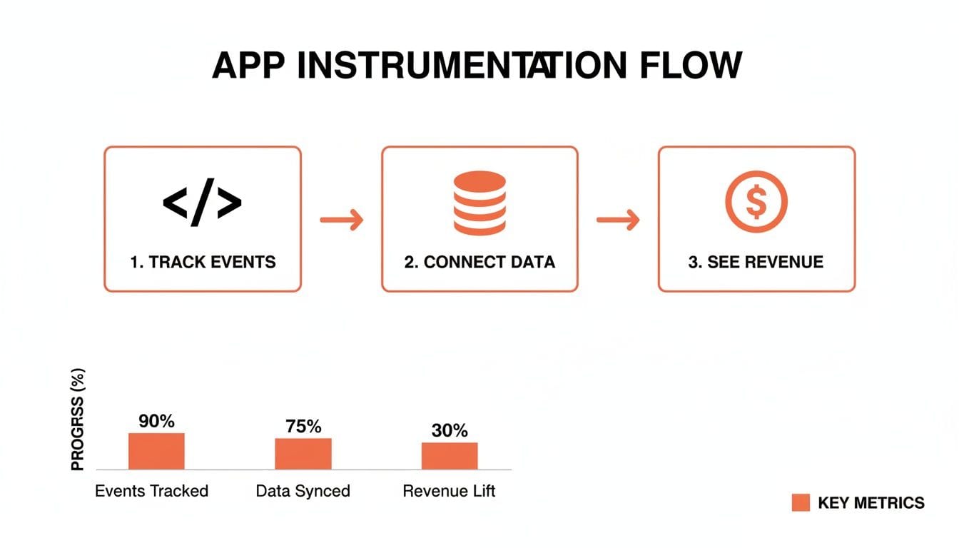
Alright, let's move from the what to the how. Knowing which retention metrics matter is one thing, but actually capturing them is where the real work begins. This is about installing the technical plumbing in your app to turn raw user taps into a clear, strategic picture.
Without proper instrumentation, your metrics are just expensive guesswork. You're flying blind.
The process boils down to integrating analytics SDKs into your app’s codebase. For a React Native app, this means you can track everything from a simple button press to a complex, multi-step onboarding flow. These tools act as your app's nervous system, sending signals back to a central dashboard where you can finally see what your users are actually doing.
Setting Up Your Event Tracking Foundation
First things first: you need to decide which user actions are worth tracking. Think of an event as any meaningful action a user takes inside your app. You aren't just logging screen views; you’re tracking behaviors that signal intent, engagement, or frustration.
For a meditation app, for instance, you wouldn't just track "app opened." You'd track events that tell a story:
- `session_start`: A user opens the app, ready to engage.
- `meditation_started`: A user commits and begins a meditation.
- `meditation_completed`: A user finishes at least 90% of a session - a huge signal of value.
- `journal_entry_created`: A user engages with a secondary feature designed to build a habit.
Implementing this in React Native with a tool like Mixpanel or PostHog is pretty straightforward. Once you’ve installed their SDK, you just call the tracking function wherever the action happens in your code.
// Example of tracking an event with Mixpanel in React Native
import mixpanel from 'mixpanel-browser';

// Inside your component or function where the action occurs
const handleStartMeditation = () => {
  // Business logic for starting the meditation...

  // Send the event to your analytics platform
  mixpanel.track('meditation_started', {
    'meditation_type': 'Guided',
    'duration_minutes': 10
  });
};
This little snippet does more than just say "someone started meditating." It attaches properties like meditation_type and duration_minutes, which are goldmines for analysis. Now you can segment users who prefer guided sessions from those who don't and see which group sticks around longer.
Connecting Behavior to Revenue with RevenueCat
For a subscription app, tracking user actions is only half the battle. The real magic happens when you tie those behaviors directly to dollars and cents. This is where subscription management platforms like RevenueCat or Adapty are non-negotiable.
These tools are brilliant because they handle the nightmare of managing in-app purchases and subscriptions across iOS and Android. More importantly, they fire their own set of events that you can pipe straight into your analytics platform.
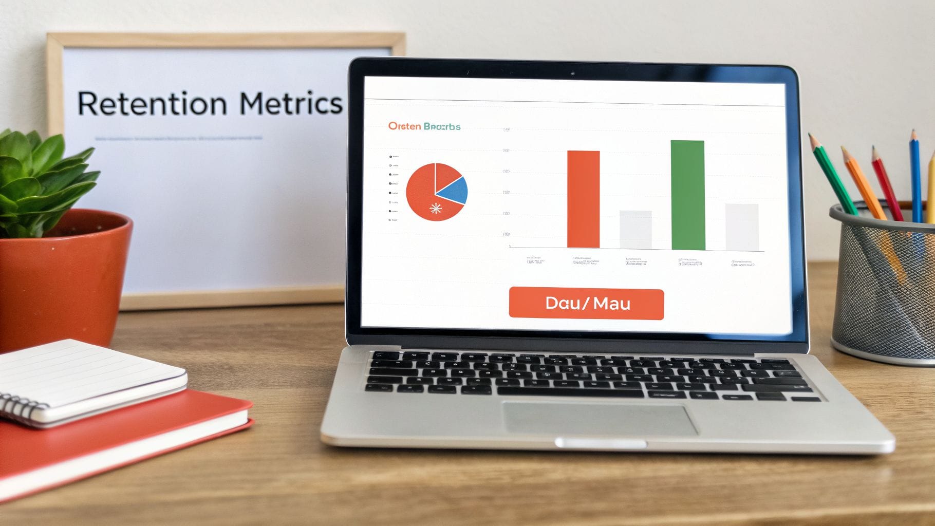
Here’s a quick look at a RevenueCat dashboard. It gives you an immediate, no-fluff overview of your subscription health.
This clean interface cuts through the noise and shows you the numbers that actually run your business, like MRR and active trials. This becomes the source of truth for all your monetization data.
RevenueCat automatically sends mission-critical revenue events to your analytics tools, letting you answer the questions that really matter:
- Which user actions are most common right before someone starts a trial?
- What do users do (or not do) in the days leading up to a subscription cancellation?
- Do users who complete our onboarding checklist have a higher Lifetime Value (LTV)?
By integrating your analytics and subscription data, you turn a mess of scattered data points into a unified command center. You can now confidently say, "Users who engage with Feature X have a 20% higher trial-to-paid conversion rate," proving a clear ROI on your team's hard work.
Once your app is properly wired to collect this data, you can unleash the power of data analytics in driving user insights to understand what makes your users tick. The combination of behavioral and transactional data is the foundation of real, sustainable growth.
To see which platforms we trust for this, check out our guide on the best analytics tools for mobile apps. This is the step where you stop guessing and start building a data foundation that leads to smarter decisions and, ultimately, much better retention.
How Your Retention Stacks Up Against the Competition
You’ve got your retention metrics wired up, and the data is finally flowing. Now comes the million-dollar question every founder asks: "Are these numbers any good?"
The only honest answer? It depends.
Comparing your app's performance to an unrelated one is like pitting a sprinter against a marathon runner. They’re both athletes, but their finish lines are in completely different zip codes. Your app’s category fundamentally shapes user behavior, and what counts as “good” retention is baked into that context.
Why App Category Is Everything
Someone might open a News app every single day, building a high-frequency habit. That same person might only use a travel app once a year to book a vacation. That’s why a one-size-fits-all benchmark isn’t just unhelpful - it’s actively misleading.
Getting this right is the first step toward setting goals that aren’t just wild guesses. Instead of chasing some arbitrary number you read in a blog post, your real mission is to become a top performer within your specific niche.
A retention rate that signals a thriving app in one category could be a five-alarm fire in another. Context isn't just important; it's the only thing that matters.
- Practical Example: An entertainment app hitting 8% Day 30 retention would be an absolute killer, placing it in the top tier. But that same 8% in the news category, where the average is over 11%, would mean you’re seriously underperforming and losing market share to competitors.
- Actionable Insight: Don't just google "good app retention." Find a recent, reputable benchmark report for your specific category (e.g., "health and fitness app retention benchmarks 2024"). This context turns a meaningless number into a powerful goal for your team.
You can find more detailed benchmarks on app retention by industry to see exactly where you stand.
This entire process, from tracking what users do to understanding how it impacts revenue, is a journey.
The key takeaway here is simple: tracking events is just the start. The real magic happens when you connect user behavior to revenue. That’s when analytics stops being a cost center and becomes your growth engine.
Day 30 Retention Benchmarks by App Category (2026)
To give you a clearer picture, we've compiled some industry averages for Day 30 retention. Remember, these are just starting points. The real goal is to beat the average and push toward the top performers in your space.
| App Category | Average Day 30 Retention | Top Performer Goal |
|---|---|---|
| News & Media | 11.3% | 15%+ |
| Social & Community | 7.5% | 12% |
| Entertainment | 6.1% | 10% |
| Health & Fitness | 4.0% | 7% |
| Education & Learning | 3.8% | 6.5% |
| E-commerce & Shopping | 3.5% | 6% |
| Finance & Fintech | 3.1% | 5.5% |
| Gaming (Casual) | 2.4% | 5% |
| Travel & Hospitality | 2.1% | 4% |
These numbers show the stark reality of mobile apps: keeping users around is hard. But knowing the battlefield is the first step toward winning the war.
Setting Retention Goals That Actually Make Sense
So, what do you do with this information? Your job is to find your true competitive set and aim for the top quartile.
If you’re building a fitness app and the average Day 30 retention is 4%, your goal isn’t 10%. It’s 6% or 7%. That’s a tough but achievable target that puts you among the best in your category. Once you hit that, you can aim higher.
Here’s how to turn this insight into an action plan:
- Define Your True Category: Are you a "social" app or a "community" app for a niche interest? Are you "education" or "professional development"? The distinction matters. Be brutally honest.
- Find Your Benchmark: Use up-to-date industry reports to find the average Day 1, Day 7, and Day 30 retention for your specific vertical. Don't just grab the first number you see.
- Set a Top-Quartile Goal: Your North Star shouldn’t be the average; it should be to land in the top 25% of apps in your category. This gives your product and marketing teams a clear, focused target for every experiment they run.
When you set informed, category-specific targets, you stop reacting to numbers and start proactively managing them. You’re no longer just measuring retention; you’re building a durable, competitive advantage one user at a time.
A Simple Framework for Diagnosing Churn

Having data is one thing. Knowing what to do with it is another game entirely. Your retention metrics are the vital signs of your app's health, and when they dip, it’s a symptom of a deeper problem.
To stop the bleeding, you have to become a product detective. Your job is to pinpoint why and when users are leaving. This isn't about guesswork; it's about following a simple but powerful diagnostic framework. Instead of just staring at a climbing churn rate, you can use this process to isolate the root cause and find the cure.
The investigation always starts in the same place: finding your app’s “Aha! Moment.”
Find Your App's "Aha! Moment"
The “Aha! Moment” is the exact point where a new user truly gets why your app is valuable. It’s when their mindset shifts from "I'm just testing this out" to "Wow, I actually need this." Identifying this moment is the single most critical step in diagnosing churn, because users who never reach it are almost guaranteed to leave.
You find it by working backward. Look at your most loyal, long-term users. What specific, common action did they all take early on that your churned users didn't?
- For a social app: It might be "adds 5 friends."
- For a project management tool: It could be "creates 3 tasks and invites one team member."
- For a fitness app: It may be "completes their first 7-day workout plan."
- Practical Example: In your analytics, you create two user segments: "Retained Users" (used the app in the last 30 days) and "Churned Users" (inactive for 30+ days). You discover that 80% of Retained Users "created a custom playlist" in their first session, while only 15% of Churned Users did.
- Actionable Insight: "Creating a custom playlist" is your Aha! Moment. Your entire onboarding flow must now be ruthlessly optimized to get every new user to that specific action as quickly as possible.
Your "Aha! Moment" isn't a feature; it's a specific, repeatable user behavior that correlates directly with long-term retention. Your entire onboarding flow should be ruthlessly optimized to get every single user to that moment as quickly and smoothly as possible.
Follow the Clues Through the User Journey
Churn doesn't just happen. It happens at specific, predictable stages of the user lifecycle. By segmenting your churn based on when it occurs, you can diagnose the problem with much greater accuracy.
Think of it as a troubleshooting flowchart for your user journey. Is the problem happening immediately, or does it crop up after a few weeks? Each timeframe points to a different kind of weakness in your product.
Stage 1: The First 24 Hours
High churn within the first day is almost always an onboarding and value proposition problem. Plain and simple. Users downloaded your app with an expectation, and you failed to meet it.
- Key Question: Did users understand what to do the moment they opened the app?
- Things to Investigate: A confusing UI, a long and mandatory signup form before showing any value, or a massive disconnect between your app store marketing and the actual in-app experience.
- Actionable Insight: If 40% of your users uninstall on Day 0, you don't have a retention problem - you have a first-impression problem. Your immediate action is to run an A/B test on your onboarding. Test A is your current flow. Test B removes two steps and immediately drops the user into the app's core feature.
Stage 2: The First Week (Day 1 to Day 7)
If users stick around past day one but leave before day seven, they likely understood the basic concept but failed to form a habit. They found some initial value, but it wasn't enough to build a routine around your app.
- Key Question: Did we give them a compelling reason to come back after their first session?
- Things to Investigate: A lack of effective push notifications, no clear "next step" after a user's first small win, or failing to introduce a core sticky feature.
- Actionable Insight: Analyze your Day 7 retained cohort. You see they all use the "daily journal" feature. Your churned users don't. The action is to implement a smart push notification on Day 2 that specifically prompts users who haven't used the journal to try it: "Good morning! Take 2 minutes to reflect in your journal."
Stage 3: After the First Week (Day 7+)
Churn after the first week points to a more fundamental product gap. These users "got it." They understood the value, maybe even started forming a habit, but your app eventually ran out of runway for them or failed to keep them engaged.
- Key Question: Does our app provide enough long-term value to justify a permanent spot on their phone?
- Things to Investigate: A lack of new content or features, a competitor offering a better experience, or a frustrating paywall that blocks meaningful progress.
- Actionable Insight: This is where you have to talk to people. Send a one-question email survey to users who cancel after 30 days: "What's the main reason you decided to cancel?" If multiple users say "I ran out of new meditation courses," you have a clear mandate for your content team to produce more advanced material. This feedback is absolute gold for your long-term product roadmap.
By using this framework, you can turn abstract mobile app retention metrics into a clear diagnostic tool. You stop being a founder who just watches numbers and become a product detective who systematically finds and fixes the leaks in your app.
Actionable Experiments to Increase Retention and MRR
Having a framework to diagnose churn is powerful, but insights without action are just expensive trivia. It’s time to turn that analysis into measurable improvements in your app.
The best way to do this is by running small, iterative experiments that directly target the drop-off points you’ve identified. These aren't massive, multi-month projects. Think of them as focused, engineering-driven tests designed to move specific mobile app retention metrics.
When you frame your ideas as experiments with clear hypotheses, you start building a product roadmap that connects directly to revenue growth and proves its own ROI.
Experiment 1: Streamline Your Onboarding Flow
If your diagnostics show a huge user drop-off in the first 24 hours, your onboarding is almost certainly the culprit. New users are impatient. They need to experience your app's core value - that "Aha! Moment" - as fast as humanly possible. This experiment tests whether simplifying the path to that moment improves Day 1 retention.
- Hypothesis: If we reduce our onboarding from six steps to a three-step flow focused solely on getting the user to complete one core action, then our Day 1 retention rate will increase because we are removing friction and accelerating time-to-value.
- Actionable Example: A journaling app's current onboarding asks users to create an account, set a password, pick a theme, set a reminder, and then write their first entry. The experimental version would drop users directly into writing their first entry and only prompt for account creation after they've hit save.
- Success Metrics:
- Primary: A statistically significant increase in Day 1 Cohort Retention. Aim for a 15-20% lift.
- Secondary: An increase in the percentage of new users who complete the core action (e.g., "First Journal Entry Created") within their first session.
Experiment 2: Gamify Early Habit Formation
When users churn between Day 1 and Day 7, it usually means they understood the value but didn't form a habit. Push notifications are a start, but they're often ignored. In-app gamification can be far more effective. This experiment introduces a simple challenge to encourage repeat behavior in that crucial first week.
People are naturally drawn to clear goals and a sense of achievement. Gamification taps into these motivators, creating a positive feedback loop that encourages users to return. Adding a "streak" or a simple checklist can be incredibly powerful.
- Hypothesis: If we introduce a "3-Day Challenge" that rewards users with a badge for completing a key action three days in a row, then our Day 7 retention will improve because we are creating a structured, motivating path to habit formation.
- Actionable Example: A language-learning app implements a "First Streak" badge that users unlock after completing a lesson for three consecutive days. The UI prominently displays their progress (Day 1 of 3, Day 2 of 3) to create a sense of momentum and a "don't break the chain" mentality.
- Success Metrics:
- Primary: A lift in Day 7 Cohort Retention.
- Secondary: An increase in the percentage of users who perform the target action on three or more days in their first week.
Experiment 3: Trigger Personalized Upgrade Offers
Improving retention isn't just about keeping free users around; it's about converting engaged users into paying subscribers and increasing MRR. Instead of showing everyone the same generic paywall, this experiment tests a personalized offer triggered by high-engagement behavior.
- Hypothesis: If we offer a 40% discount on the annual plan to users who have completed 10+ core actions within their first month, then our trial-to-paid conversion rate and LTV will increase because the offer is timely, relevant, and targeted at our most qualified users.
- Actionable Example: A fitness app tracks
workout_completedevents. Once a user's count hits 10, it triggers an in-app message: "You're building an amazing habit! Lock in your progress and save 40% with an annual plan." This feels earned, not sold. - Success Metrics:
- Primary: An increase in the conversion rate from free/trial to a paid annual subscription for the targeted cohort.
- Secondary: An increase in the average LTV of new user cohorts.
By running these kinds of focused product experiments, you move from reacting to data to proactively shaping it. At Vermillion, we embed with teams to ship exactly these types of high-impact features, turning retention insights into weekly engineering output that grows your MRR.
Even after you’ve got the data and frameworks, the day-to-day reality of focusing on mobile app retention brings up some tough questions. I see founders wrestle with the exact same hurdles when they finally make the shift from just acquiring users to actually keeping them.
Here are the straight answers to the questions that come up most often.
What Is a Good Retention Rate for a New App?
Forget trying to find a single magic number. A "good" rate is completely dependent on your app's category. The only thing that matters is how you stack up against your direct competition.
For example, a 4% Day 30 retention rate might be average for a fitness app. But if you're building a news app, you should be aiming for something closer to 10%.
When you're just starting out, your obsession should be the Day 1 to Day 7 window. If you can get 20% of your first users to stick around for a week, you've built something worth scaling. From there, your goal is simple: consistently beat the average for your vertical.
A "good" retention rate isn't a fixed number. It's a moving target that's always slightly better than your industry's average and consistently improving, week over week.
When Should I Start Tracking Retention Metrics?
Day one. No exceptions.
In fact, you should have your core event tracking for Day 1, Day 3, and Day 7 cohort retention fully instrumented before you spend a single dollar on marketing.
The data from your first hundred users is gold. It’s the purest signal you’ll ever get on your core value proposition and whether your user flow is broken. Tracking this stuff from the start stops you from pouring money into a leaky bucket. It also gives you a baseline to measure the impact of every single product decision you make from that point forward.
Can I Improve Retention Without an Engineering Team?
You can get small, temporary bumps. A few re-engagement emails or a push notification campaign might give you a short-term lift.
But significant, long-term improvements to your core retention almost always come from changing the product itself.
That means iterating on your onboarding flow, building features that create genuine habits, and personalizing the in-app journey. For a non-technical founder, this is usually the biggest bottleneck to growth. It’s also where having a partner who can rapidly ship these product experiments becomes the difference between stalling out and actually moving your retention and MRR.
If you're a subscription app operator bottlenecked by slow engineering, Vermillion can help. We embed a senior React Native team into your workflow to ship the onboarding tests, paywall experiments, and engagement features that directly improve your retention and MRR. Stop guessing and start shipping.
Keep reading
See all →
March 22, 2026
Unlocking Revenue Your Guide to Price Tier Strategy

March 21, 2026
Your Guide to Flawless Stripe Subscription Management

May 14, 2026
Fractional Mobile Engineering vs. Full-Time Hiring in 2026
The mobile engineering talent market has shifted dramatically over the past two years. Budgets are tighter, AI tools have changed what a sin...
March 20, 2026
Recurring Billing With Stripe a Guide for Subscription Apps
Master recurring billing with Stripe. This guide covers everything from setup and server logic to webhooks and churn reduction for subscript...

March 18, 2026
How to Launch an App in 2026 A Startup Playbook
Learn how to launch an app with our complete playbook for subscription startups. Covers MVP development, app store release, analytics, and g...