Vermillion Insights
March 2, 2026 · Ken Vermeille · 15 min read
Mastering the Elements of Design Color for Product Success
Go beyond aesthetics. Learn how the core elements of design color - hue, value, psychology, and accessibility - drive user engagement and business growth.

When you think about the core elements of design, color often feels like the last, most subjective layer - a final coat of paint. But in product design, color is much more than decoration. It's a strategic tool, a silent partner that communicates your brand's values and guides user behavior from the very first glance.
Why Color Is Your Product's Silent Cofounder

Forget seeing color as just a finish. In modern product design, it’s a fundamental force that silently shapes user emotions and actions. It’s the very first thing a user processes, often subconsciously, making it a massive part of their initial impression. Get it wrong, and you create confusion. Get it right, and you build an immediate sense of trust and clarity.
This isn't about picking your favorite colors. Strategic color choices are rooted in a mix of science, psychology, and careful planning. A well-designed palette makes call-to-action buttons pop, ensures error messages are impossible to ignore, and infuses your brand’s personality into every single screen.
The Building Blocks of Strategic Color
To really master color, you have to understand what it's made of. We’ll walk through the essential elements of design color with a practical focus, moving from basic principles to how they're applied in the real world.
We'll cover:
- The Physics of Color: We’ll break down Hue, Value, and Saturation, giving you the language to understand and direct color choices with total precision.
- The Dynamics of Relationships: You’ll learn how to build balanced and effective palettes using proven color harmonies straight from the color wheel.
- The Business Impact: We'll connect the dots between color psychology, accessibility, and real business metrics like user retention and conversion rates.
Understanding these elements is just as critical as having a solid technical architecture. A thoughtful color system prevents expensive redesigns down the road and helps build a product that's set up for growth.
This mindset is crucial in agile design, where even small, iterative improvements can have a huge impact. Integrating color strategy early on - just like you’d plan a scalable codebase - ensures every visual choice supports your product's long-term goals. For more on this, check out how we integrate design in agile methodology and see how that early strategic planning pays off.
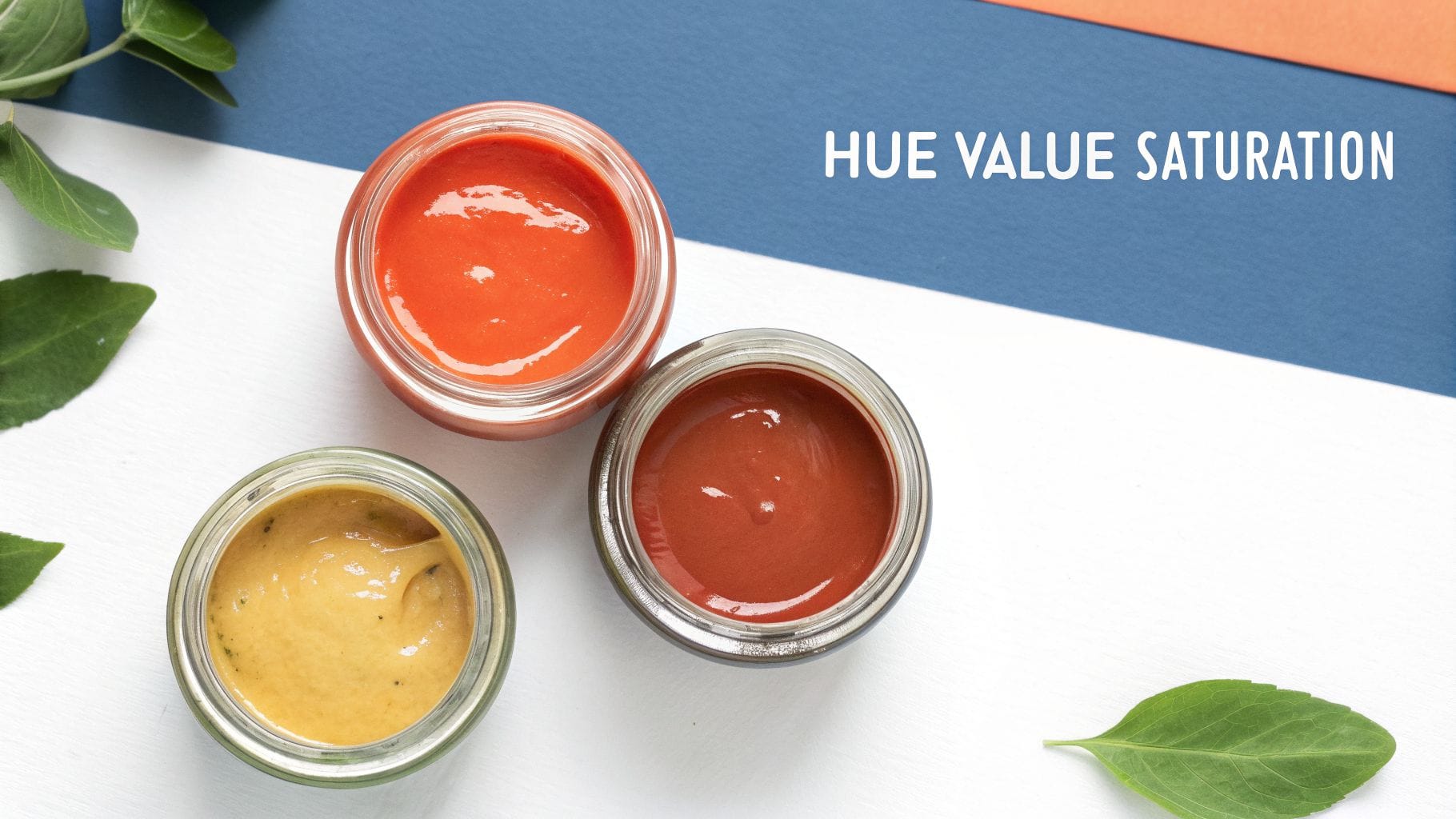
Decoding the DNA of Color: Hue, Value, and Saturation
To really get a handle on color, you have to break it down into its three core ingredients: Hue, Value, and Saturation (sometimes called HVS). Once you get these, you move from vague feedback like "make it pop more" to giving precise, actionable direction that actually improves your product.
Think of it like being a chef. You don't just throw random ingredients in a pot. You understand what salt, fat, and acid do, and you use them with intention. HVS is your recipe for creating any color you can imagine, giving you total control over your app’s visual language.
Hue: The Pure Color
Hue is the first thing we notice about a color. It's the pure pigment, the name we give a color at its most basic - red, green, blue. It’s what you see on a classic color wheel.
Actionable Insight: When establishing your brand identity, your primary hue is your anchor. A fintech app should lean toward a blue hue to convey trust and security. A food delivery app might choose a red or orange hue to stimulate appetite and create excitement. This initial choice sets the entire psychological tone for your product.
When you’re picking a primary hue for your brand, you’re making a huge decision about its emotional tone. A deep, dependable blue says "trust us," while a bright, optimistic yellow shouts "we're energetic and friendly." This single choice becomes the anchor for your entire color palette.
Hue is the identity of a color. It's the answer to the simple question, "What color is it?" Every single shade, tint, and tone starts with a pure hue.
Getting the hue right is the first step in building a visual system that feels right. It ensures the core feeling you want your product to evoke is baked in from the very beginning.
Value: The Lightness or Darkness
Value is all about the lightness or darkness of your hue. It’s how much white or black you've mixed in. When you add white, you create a lighter tint. When you add black, you create a darker shade.
This is an incredibly powerful tool for creating visual hierarchy and a sense of depth without having to add more colors to your palette.
Actionable Insight: Use value to define interactive states clearly. For example, a button’s default state could be your mid-value primary blue. On hover, use a slightly lower value (darker shade) to give clear visual feedback. For a disabled state, use a much higher value (lighter tint) to signal it's non-interactive while keeping the interface consistent.
Here’s a practical example:
Let's say your primary brand color is a medium blue. By just playing with its value, you can create a whole family of related colors.
- High Value (Lighter Blue): This is perfect for large background areas or subtle hover effects on buttons.
- Mid Value (Your Primary Blue): Save this for the important interactive stuff, like links and key icons.
- Low Value (Darker Blue): Use this for your text. It creates great contrast against the lighter backgrounds, making everything easy to read.
This approach gives you a clean, sophisticated UI that feels incredibly unified and deliberate.
Saturation: The Intensity or Purity
Saturation is the intensity of a color. A fully saturated color is pure, vivid, and bold. A desaturated color is muted, grayish, and feels much more subdued.
You can use saturation to guide the user's eye exactly where you want it to go.
Actionable Insight: Create a clear visual hierarchy by controlling saturation. In a dashboard, you might use highly saturated colors for critical alert notifications or the main "Upgrade" CTA. Meanwhile, less important elements like secondary navigation links or background card elements can be desaturated. This makes the important actions pop without overwhelming the user.
For instance, if you slightly desaturate your background elements and secondary text, you make a fully saturated "Sign Up" button feel like it's jumping off the screen. This creates a powerful focal point, nudges users toward key actions, and directly helps improve things like conversion rates.
To tie this all together, think about how each of these three elements serves a distinct purpose in your UI design. They aren't just abstract concepts; they are practical tools that influence user behavior and, ultimately, your business goals.
How Hue, Value, and Saturation Impact UI Design
| Element | Simple Analogy | Practical UI Application | Impact on Business KPIs |
|---|---|---|---|
| Hue | The flavor of an ice cream (strawberry, chocolate). | Establishes brand identity and emotional tone. Defines primary, secondary, and accent colors. | Affects brand recognition and user perception. The right hue can build trust and drive emotional connection. |
| Value | Turning a light dimmer up or down. | Creates visual hierarchy, depth, and legibility. Defines states (hover, active, disabled) and separates UI layers. | Improves usability and task completion rates. High-contrast values increase accessibility, expanding your user base. |
| Saturation | Adjusting the "vibrancy" filter on a photo. | Draws attention to key elements like CTAs. Differentiates interactive vs. non-interactive elements. | Directly boosts conversion rates by guiding users to desired actions. Improves user engagement by creating clear focal points. |
Mastering the interplay between Hue, Value, and Saturation is what separates amateur design from professional, user-centric work. It allows you to build a visual system that is not only beautiful but also highly functional and aligned with your business objectives.
Building Palettes with Color Harmonies
Once you’ve got a handle on the DNA of a single color, the next step is putting them together. You can't just throw colors at a screen and hope for the best; you need to build a palette.
This isn't about guesswork. It’s about using proven frameworks called color harmonies. Think of them like musical chords - certain notes just sound right together. Color harmonies are the visual equivalent, using the color wheel as a guide to create combinations that feel balanced and intentional.
These frameworks give your design team a reliable playbook. By understanding why certain pairings work, you can move beyond "it looks good" and start building palettes that actively drive user engagement and hit your business goals.
Complementary Colors for High Impact
The most dramatic harmony you can use is a complementary one. This is where you pair two colors from directly opposite sides of the wheel, like blue and orange, or red and green. The result is the highest possible contrast, which creates a vibrant, high-energy feel.
That intensity is a powerful tool for grabbing attention.
Actionable Insight: Use a complementary color for your most important call-to-action (CTA). If your brand's primary color is a calming blue, make your "Book a Demo" button a vibrant, contrasting orange. This creates a visual focal point that guides the user's eye directly to the action you want them to take, boosting conversion rates.
Analogous Colors for a Serene Experience
On the complete opposite end of the spectrum is the analogous harmony. Instead of opposites, you use colors that sit right next to each other on the color wheel - think blue, blue-green, and green. This creates a low-contrast, cohesive, and remarkably serene feeling.
This harmony is your go-to when the goal isn't to jolt a user into action, but to create a calm, immersive space.
Actionable Insight: A meditation or wellness app is a perfect use case. A palette of gentle blues, aquas, and soft greens creates a tranquil interface that reinforces the brand promise. This is a strategic choice that supports user retention by making the app an inherently pleasant, low-stress environment to return to.
Triadic Colors for Dynamic Balance
A triadic harmony strikes a great middle ground, giving you vibrant contrast while still feeling balanced and stable. It uses three colors that are evenly spaced around the color wheel, forming a triangle - for instance, red, yellow, and blue.
Actionable Insight: A triadic scheme is great for products that need to differentiate multiple, equally important features or categories. For example, a project management tool could use a blue, yellow, and red triadic palette to color-code "To Do," "In Progress," and "Overdue" tasks. The colors are distinct enough to be instantly recognizable but feel balanced together in the UI.
Exploring these combinations can be much easier with modern tools. If you want to visualize how these principles apply to softer tones, an AI Pastel Palette generator can help you quickly generate harmonious combinations based on these very rules.
Ultimately, these harmonies provide the structure you need to ensure your brand's visual language is both intentional and effective.
How Color Psychology Drives User Behavior and Trust
Once you move past harmonies and palettes, you get to the real power of color in design: psychology. The colors you choose aren’t just about making things look good. They’re strategic business decisions that tap into deep-seated human emotions, directly shaping how users feel about your brand and what they do on your platform.
This isn’t about fuzzy feelings, either. It’s about making data-driven choices that lead to measurable results. Ever wonder why so many fintech apps, banks, and B2B SaaS platforms build their brand around blue? It’s because blue is consistently linked to trust, security, and stability - exactly the qualities you need customers to feel when they're managing their money or sensitive business data. You can dig deeper into the blue meaning of color to see how these associations play out.
Driving Action with Emotional Cues
Color psychology isn’t just for building passive trust; it’s a powerful tool for getting users to take action. E-commerce sites are masters of this, often using red to create a sense of urgency.
Actionable Insight: To drive immediate sales during a promotion, change your "Add to Cart" button to red and pair it with copy like "Sale Ends Today." The red triggers a sense of urgency and scarcity, which can directly increase short-term conversion rates. In contrast, for a confirmation screen after a purchase, use green. The green "Order Confirmed" message provides instant positive reinforcement, creating a satisfying user experience.
Key Takeaway: Color choices are business decisions. The right color in the right place guides users, makes information clearer, and can directly lift brand recognition and revenue.
First impressions happen in a flash, and color is one of the main drivers. Research shows that a staggering 62-90% of a person's snap judgment of a product is based on color alone. This is especially critical in high-stakes environments where a first impression can make or break a deal. Using color consistently can also boost brand recognition by up to 80%, a massive leg up in a crowded market.
Visualizing Color Relationships
Understanding these psychological triggers becomes even more effective when you pair them with color harmonies. The visual below breaks down the core relationships - complementary, analogous, and triadic - that form the structural backbone of any good color palette.
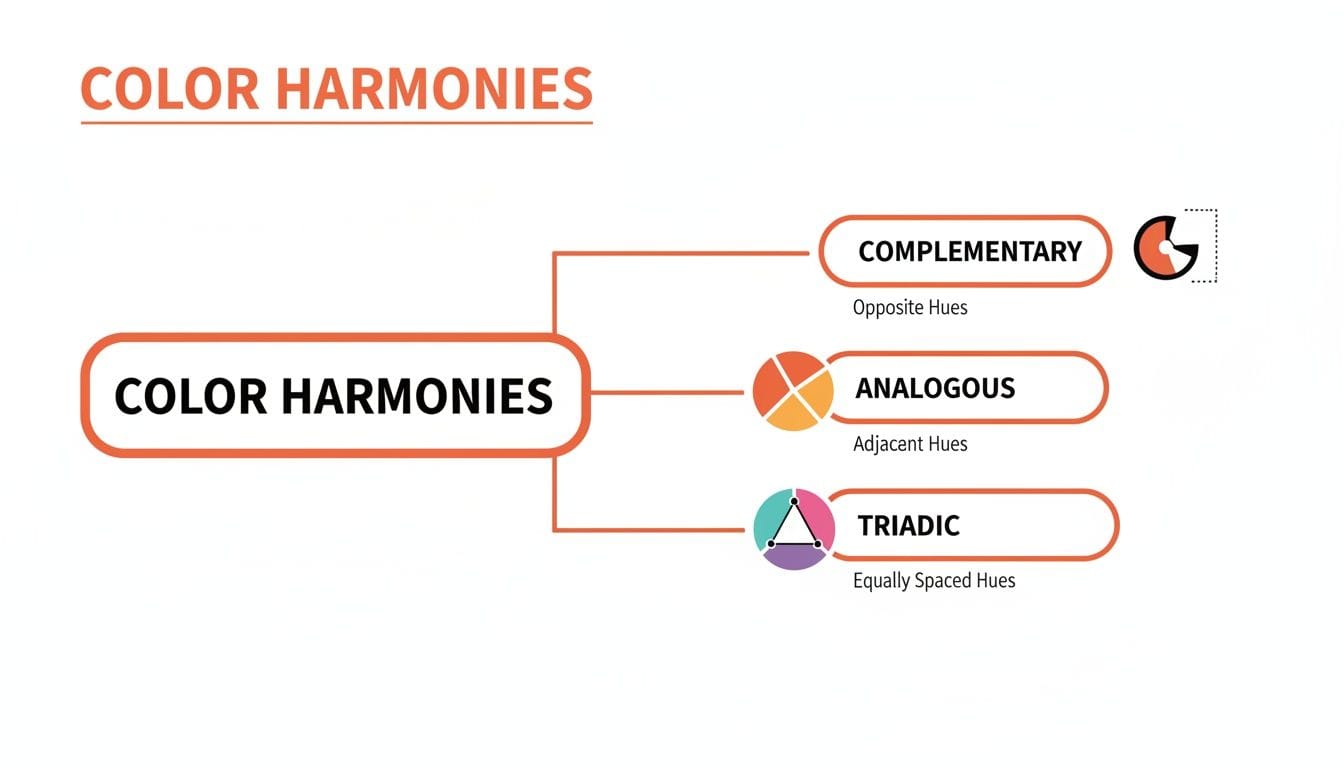
This diagram shows how different color pairings create specific levels of contrast and emotional tone. Picking the right harmony is just as vital as choosing the right primary color; it sets the entire mood of your design. For example, the high contrast of a complementary scheme generates energy and excitement, while the low contrast of an analogous one feels more calm and harmonious.
This single choice directly affects user engagement. It can be a critical factor in a product’s success, much like how a thorough https://vermillion.agency/insights/ux-audit-services/ can spot foundational risks before they ever impact your users.
Designing for Everyone with Accessible Color
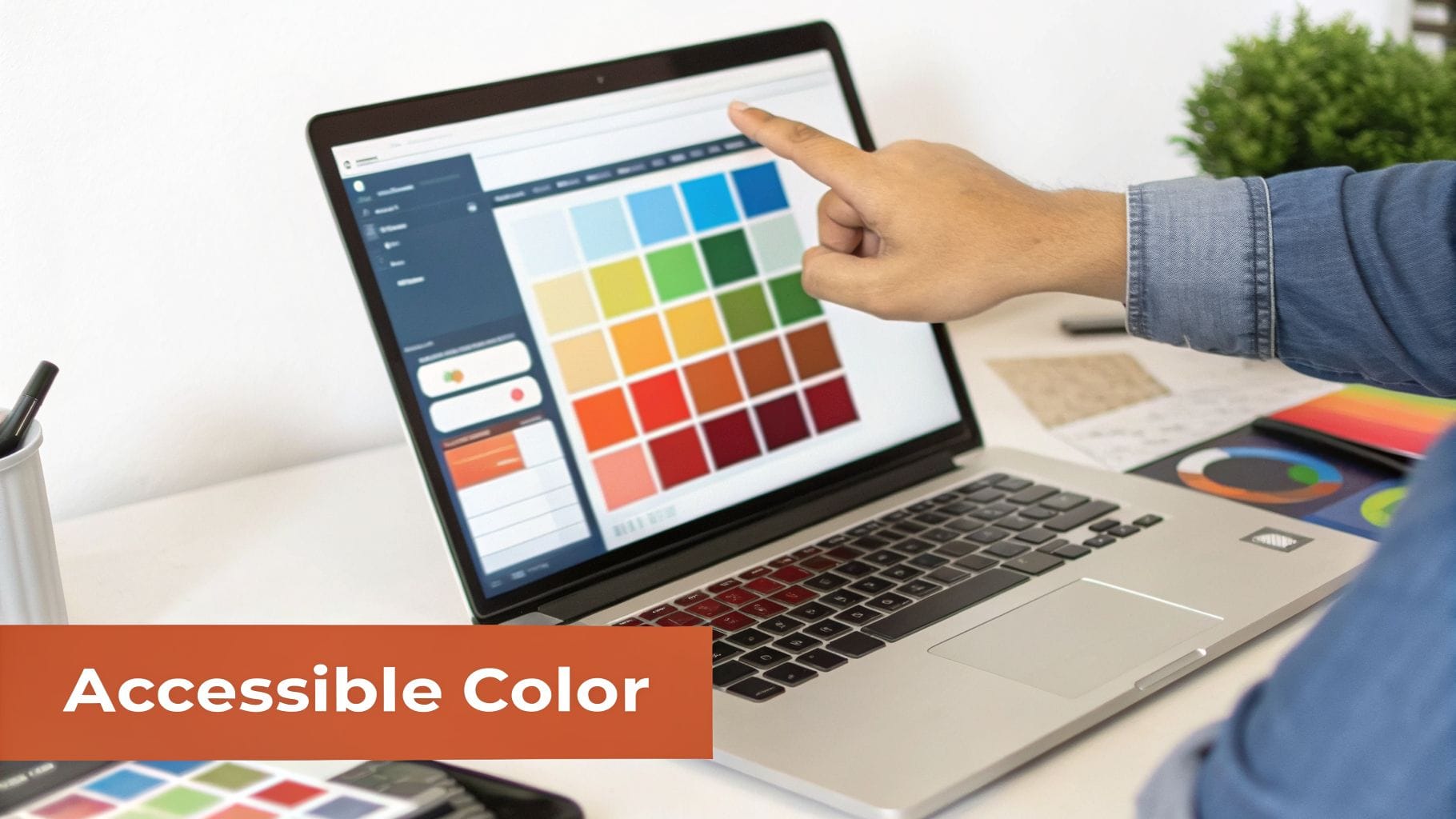
Let's get one thing straight: color accessibility isn't a niche, "nice-to-have" feature. It's a business fundamental.
When you design with accessibility in mind, you’re not just helping a small group of users. You’re opening your app to the one in 12 men and one in 200 women with color vision deficiency. You're also improving usability for everyone and shielding your company from legal headaches tied to non-compliance.
Think of it like building a scalable tech stack. You wouldn't build an app on a foundation that can't grow, so why design a user interface that locks people out? Tackling accessibility from day one saves you from expensive redesigns and creates a better product for every single user. The heart of it all? Color contrast.
Understanding WCAG Contrast Ratios
The Web Content Accessibility Guidelines (WCAG) give us a clear, numbers-based framework to follow. The most important rule to get right is the contrast ratio - the difference in brightness between your text and its background.
- AA Standard: This is the baseline. You need a contrast ratio of at least 4.5:1 for regular text. For larger text (think 18pt or 14pt bold), you can get away with 3:1.
- AAA Standard: This is the gold standard. It demands a much stricter ratio of 7:1 for normal text and 4.5:1 for large text.
These numbers aren't just abstract theory. That trendy light-gray text on a white background? It looks clean, but it's almost guaranteed to fail contrast checks, making parts of your app completely unreadable for a huge chunk of your audience.
Actionable Insight: Never guess. Integrate a contrast checker directly into your design workflow. Tools like Figma's built-in accessibility plugins can check your entire design system at once. Make it a mandatory step in your design handoff process to ensure no inaccessible color combinations make it to production.
This idea of clear, effective communication is so powerful it even shapes brand identity. Take a look at the world’s biggest companies - a staggering 81.6% use just two colors or fewer in their logos. Why? Because simplicity is memorable, versatile, and instantly recognizable everywhere. These fascinating findings from logo statistics show that less is almost always more.
Practical Tips for Accessible Palettes
Building an accessible color palette doesn't mean sacrificing your brand's personality. It means making smarter, more intentional choices.
- Don't Rely on Color Alone: This is the golden rule. Never use color as the only visual cue for important information. If an input field has an error, don't just give it a red border. Add an "X" icon or a clear error message text like "Invalid email address." This ensures users with color blindness can still identify and fix the issue.
- Test Your States: A button isn't just one color. It has hover, focus, and disabled states. A common mistake is making disabled buttons so low-contrast they become illegible. Actionable Tip: Ensure disabled buttons maintain at least a 3:1 contrast ratio for their text. This allows users to understand what the button does, even if they can't interact with it, which is crucial for context.
When you bake these habits into your design process, you're not just checking a compliance box. You’re building a product that’s fundamentally better, more inclusive, and easier for everyone to use.
Your Guide to Building and Testing a Product Palette
Building a great color palette isn't about some flash of artistic inspiration. It's a system. And it doesn't start with picking colors - it starts with picking words.
Before you even look at a color wheel, define your brand’s personality in a few keywords. Are you "Trustworthy" and "Secure"? Or maybe "Playful" and "Bold"? These words are your north star, giving you a clear direction and preventing you from choosing colors just because you like them.
Once you have your keywords, you can select a primary color that truly embodies your main brand attribute. Blue is a popular choice, and for good reason. A massive 42% of people worldwide name blue as their favorite color. But this goes beyond personal preference. The data shows 33% of the world's top brands use blue because it signals trust and security. For websites, 46% of consumers prefer blue. You can discover more fascinating color statistics to see just how deep these biases run.
Building Your Palette with the 60-30-10 Rule
With your primary color locked in, you can build out the rest of your palette using a time-tested framework. The 60-30-10 rule is a classic design principle that brings balance to a user interface and guides the user's eye exactly where you want it to go.
Think of it as a recipe for a clean, effective UI:
- 60% Primary Color: This is your workhorse. It’s often a neutral or a muted version of your main brand color. It covers the most space, like backgrounds, setting the overall mood without being distracting.
- 30% Secondary Color: This color supports your primary hue and is used to create gentle contrast for secondary information. It’s perfect for things like sidebars, content cards, or info boxes that need to stand apart from the main background.
- 10% Accent Color: This is your money-maker. It should be the most vibrant color in your palette, used sparingly but powerfully for your most critical interactive elements. Think call-to-action buttons, crucial icons, and links. Its only job is to get clicked.
Actionable Insight: For a fintech app, your palette might be: 60% light gray (neutral background), 30% brand blue (for information panels and active navigation), and 10% vibrant green (for "Confirm Payment" buttons and success notifications). This structure creates a clean, professional interface where the most important actions are impossible to miss. Effective product design is built on this kind of deliberate, psychology-driven decision-making.
Test Your Palette with Data
In product design, taste is irrelevant. The only way to know if your colors actually work is to test them against real user behavior. A/B testing is how you move from "I think this looks better" to "I know this converts better."
An A/B test is simple: you show two versions of a screen to different groups of users and measure which one performs better on a specific goal.
Actionable Example: Let's say you're debating between a green "Sign Up" button and your brand's primary blue one. Set up an A/B test where 50% of new visitors see the green button and 50% see the blue one. Track the signup conversion rate for each group over a week. If the green button results in a 15% higher conversion rate, the data has definitively chosen your button color for you. This data-driven approach removes subjectivity and directly ties color choices to business growth.
When you get down to it, mastering color isn’t some fluffy, artistic luxury - it's a core business skill. It’s about getting past what you personally like and using color as a tool to shape how people feel, guide what they do, and ultimately, drive results you can actually measure. From the fundamental science of hue, value, and saturation to the deep-seated psychology of brand trust, every color choice you make sends a signal.
A well-designed, scalable color system is a lot like a well-architected piece of software. Both demand expert judgment, both are built with future growth in mind, and both will break under pressure if they aren't solid from the start.
A thoughtful color strategy isn't a "nice-to-have." It's a direct line to higher conversions, a better user experience, and a brand that people remember and trust.
So take a hard look at your own product. Is your color palette just something that was picked on a whim, or is it actively working to help you hit your goals? The gap between a product that stalls and one that thrives is often filled with these small but powerful, colorful details. This is the kind of disciplined thinking that ensures what you build today is ready for whatever comes next.
Your product's foundation is everything. At Vermillion, we build, protect, and scale software right the first time, avoiding the hidden mistakes that cost founders time and money. If you need a technical partner who pairs senior-level judgment with hands-on execution, find out how we build products that last.
Keep reading
See all →
March 22, 2026
Unlocking Revenue Your Guide to Price Tier Strategy
March 21, 2026
Your Guide to Flawless Stripe Subscription Management

May 14, 2026
Fractional Mobile Engineering vs. Full-Time Hiring in 2026
The mobile engineering talent market has shifted dramatically over the past two years. Budgets are tighter, AI tools have changed what a sin...
March 20, 2026
Recurring Billing With Stripe a Guide for Subscription Apps
Master recurring billing with Stripe. This guide covers everything from setup and server logic to webhooks and churn reduction for subscript...

March 19, 2026
Unlocking Growth with Mobile App Retention Metrics
Discover the mobile app retention metrics that directly fuel MRR growth. This founder's guide offers actionable strategies to track, analyze...