What is cohort analysis? A Practical Guide to Growth

At its core, cohort analysis is about grouping users based on a shared experience—usually when they signed up—and then watching how they behave over time. Instead of lumping everyone into one giant, anonymous pool, this method gives you a crystal-clear view of how specific groups engage, stick around, or disappear. It's the key to spotting trends that big, top-level metrics almost always miss.
Understanding Cohort Analysis Beyond the Definition

Think of your entire user base like a high school. If you only look at the school’s overall GPA, you get a single, blended number that tells you very little. It's just an average.
But what if you started tracking each graduating class—freshmen, sophomores, juniors, and seniors—as separate groups? Suddenly, you can answer much more interesting questions. You could see if the sophomore class is improving faster than the juniors, or if that new curriculum you introduced for the freshmen is actually boosting their scores.
That’s exactly what cohort analysis does for your product. By grouping users into cohorts—like the “January 2024 Signups”—you stop staring at noisy averages and start seeing real, actionable patterns. For founders and product leaders, this shift in perspective is a total game-changer.
Why Cohorts Matter More Than Averages
Aggregate metrics like "monthly active users" can be dangerously misleading. A huge spike in new signups might look fantastic on a chart, but it could be masking a massive retention problem where new users are leaving just as fast as they arrive. This is the classic "leaky bucket" problem, and cohort analysis is how you find the holes.
This method became an absolute necessity during the SaaS boom of the early 2010s, giving startups a reliable way to track user retention and make much smarter decisions about where to invest their resources. For example, a software company might analyze 5,000 customers and discover that a cohort from Month 1 retained 80% of its users by Month 2, but that number plummeted to 45% by Month 6. That's a clear signal that something in the product experience is failing to deliver long-term value.
You can dive deeper into how businesses use these groupings in our guide to data-driven insights for product development.
A primary goal of cohort analysis is to effectively define customer retention and understand how user groups behave over time, providing crucial insights for growth.
By looking through the lens of cohorts, you can finally get straight answers to the questions that actually drive your business forward:
- Product Improvements: Did the new collaboration feature we launched in March actually improve retention? Compare the March cohort's 30-day retention to the February cohort's. If March is higher, the feature is likely a success.
- Marketing Effectiveness: Are the users we're getting from LinkedIn campaigns sticking around longer than the ones from Google Ads? Create separate cohorts for each channel from the same month and track their retention. Actionable Insight: If LinkedIn users retain 15% better after 90 days, shift more of your ad spend there.
- Onboarding Success: Are users who complete our onboarding checklist more likely to be active after 30 days? Create a cohort of users who finished the checklist and one for those who didn't. If the first group's retention is significantly better, you have clear evidence to prioritize getting more users through that checklist.
So, what is cohort analysis, really? It’s a tool for clarity. It helps you see what's truly happening with your users so you can build a product that gets better over time and, most importantly, keeps the customers you worked so hard to win.
To make these ideas a bit more concrete, here’s a quick breakdown of the core concepts you'll encounter.
Core Concepts of Cohort Analysis at a Glance
This table breaks down the fundamental building blocks of cohort analysis, giving you a quick reference for the key terms.
| Concept | What It Means for Your Product | Example |
|---|---|---|
| **Cohort** | A group of users who share a common characteristic, usually their acquisition date. | "All users who signed up in January 2024." |
| **Cohort Size** | The total number of users in a specific cohort. This is your starting point, or **100%**. | "The January 2024 cohort has **1,000** users." |
| **Time-Based Event** | The action that defines the cohort, like signing up or making a first purchase. | "User created an account." |
| **Behavioral Event** | The action you track over time to measure engagement or retention. | "User opened the app," "User made a purchase," "User upgraded." |
| **Time Period** | The intervals you use to track behavior (e.g., daily, weekly, monthly). | "Tracking monthly app opens for the January 2024 cohort." |
Think of these as the ingredients. By combining them in different ways, you can cook up powerful insights that reveal the true health and trajectory of your product.
The Two Types of Cohorts That Drive Product Decisions
To get real answers from your data, you have to ask the right questions. With cohort analysis, that starts by picking the right group. Product leaders usually lean on two powerful ways of slicing up user data to make smart decisions.
The first—and most common—is the Acquisition Cohort. This is just a fancy way of saying you’re grouping users by when they signed up. Think of them like graduating classes: the “January 2024 Signups,” the “February 2024 Signups,” and so on.
This approach is killer for understanding if your product is getting better at keeping users around. If your January group sticks around longer than your December one, that's a massive signal your latest product updates or marketing efforts are actually working.
Acquisition Cohorts Uncover Time-Based Trends
Acquisition cohorts are perfect for seeing the long-term ripple effects of specific projects. Let’s say you ran a huge marketing campaign in Q1. You can isolate the users who signed up during those months and see if they turned into more loyal, valuable customers than the ones who joined during a quiet Q2. It’s a direct line from marketing spend to user quality.
Practical Example:
A SaaS company runs a major product-led growth (PLG) campaign in January, focusing on a new freemium tier.
- January Cohort (PLG Campaign): 5,000 signups, 15% 3-month retention.
- February Cohort (No Campaign): 1,000 signups, 35% 3-month retention.
Actionable Insight: The campaign brought in a lot of users, but they were low-quality and churned quickly. The team should re-evaluate the campaign's targeting or the freemium offering itself to attract users who are more likely to stick around. You can find out more about how product changes impact retention in different markets.
Behavioral Cohorts Reveal Your 'Magic Moments'
While acquisition cohorts tell you when users showed up, Behavioral Cohorts tell you what they did. Here, you group users based on a key action they took within their first few days or weeks. This is where you find the "magic moments" that turn casual users into die-hard fans.
This method lets you stop guessing and start proving what makes users stick.
Behavioral cohorts move you from correlation to causation. They don't just show you that retention is improving; they help you understand why by linking specific user actions to long-term value.
Practical Example:
A project management tool wants to understand what drives long-term engagement. They create two behavioral cohorts from their January signups:
- Cohort A: Users who invited at least one teammate in their first week.
- Cohort B: Users who did not invite a teammate in their first week.
After three months, they find that Cohort A has a 40% retention rate, while Cohort B only has a 10% retention rate.
Actionable Insight: Inviting a teammate is a critical "aha!" moment. The product team should now focus on making this action as prominent and easy as possible during the onboarding flow, perhaps by adding a guided tutorial or an incentive.
Running Your First Cohort Analysis Step by Step
Jumping into cohort analysis feels a lot more intimidating than it actually is. You don't need a data science degree. All it takes is a clear question and a logical process to get from a pile of raw data to an insight that can genuinely change your product's trajectory.
We'll walk through a five-step framework that works whether you're using a sophisticated tool like Amplitude or just a simple spreadsheet.
Step 1: Start With a Sharp Question
The best analysis never starts with the data; it starts with a problem. A vague goal like, "Let's check retention," is a recipe for getting lost in endless charts. You'll stare at numbers for hours without a clue what you're looking for.
Instead, get specific. Pinpoint a real business question you need to answer.
For instance, you might ask:
- "Do users who complete our onboarding checklist stick around longer than those who don't?"
- "Which of our Q3 marketing channels brought in users with the highest 90-day retention?"
- "Did that new feature we launched in May actually reduce user drop-off in the first month?"
A focused question is your compass. It keeps the entire process grounded and ensures you end up with an answer, not just more data.
Step 2: Identify the Essential Data
With your question locked in, you can now figure out what data you actually need. The good news is you don't need every single data point on your users—just the essentials to answer your question. This info usually lives in your product analytics platform, CRM, or main database.
For a standard user retention analysis, you'll need a few key fields. It's a surprisingly short list.
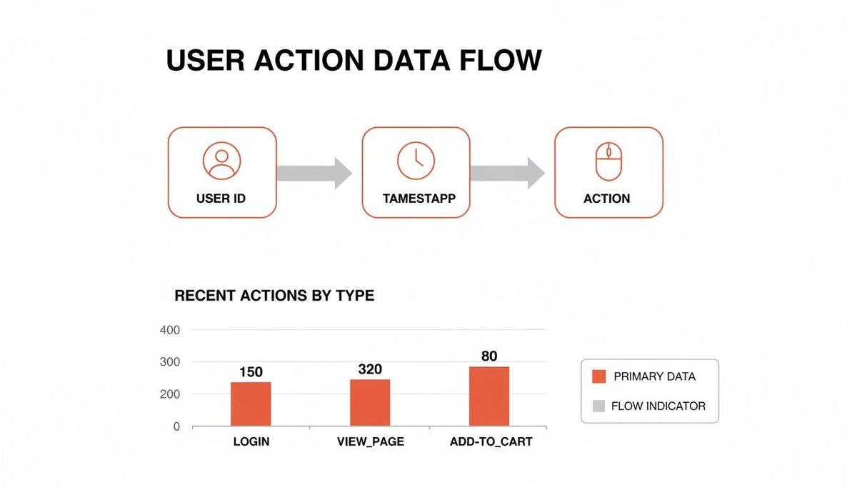
Data Points Required for Retention Analysis
To build a meaningful cohort chart, you need to pull a few specific pieces of information from your analytics or database. Here’s a quick checklist of the absolute must-haves.
| Data Point | Description | Example |
|---|---|---|
| **User ID** | A unique identifier for each user. | `user_12345` |
| **Acquisition Date** | The date the user signed up or took their first key action. | `2024-01-15` |
| **Activity Date** | The date of each subsequent action you're tracking (e.g., login, purchase). | `2024-02-10` |
That's really it. With just these three fields, you have everything you need to see who signed up, when they signed up, and when they came back.
Step 3: Group Users Into Relevant Cohorts
Now it's time to group your users into buckets that make sense for your question. If you're looking at the impact of a marketing campaign, you’ll create acquisition cohorts based on when users signed up. If you're digging into a product feature, you’ll build behavioral cohorts based on whether or not users actually used that feature.
The whole point here is to create distinct groups whose behavior you can compare side-by-side. This comparison is where the magic happens—it’s what shows you what’s working and what isn’t.
Step 4: Build and Visualize the Data
This is where you bring it all together in a cohort chart. Don't let the grid of numbers scare you; it's pretty intuitive once you get the hang of it. Each row represents a cohort (like "January Signups"), and the columns track the time that’s passed since they joined (Month 0, Month 1, Month 2, and so on).
The numbers inside the cells show the percentage of users from that original group who were still active during that time period.
Here’s what a classic cohort retention chart looks like.
This visual format makes it instantly obvious how retention changes over time. You can see at a glance that the "Week of Dec 11" cohort drops from 100% retention at Week 0 to just 1.6% by Week 11.
Step 5: Translate Patterns Into Insights
Finally, the fun part: finding the story in the data. Look for patterns, anomalies, and trends. Are newer cohorts sticking around longer than older ones? That’s a huge win and proof that your product improvements are paying off. Does one behavioral cohort have a dramatically better retention curve than the others? You’ve probably stumbled upon a key "aha!" moment in your user journey.
The goal isn't just to observe these patterns but to turn them into action. For example, if you discover that users who complete your onboarding have 20% higher retention after three months, your next move is crystal clear: find every possible way to get more new users through that onboarding flow.
How to Read Cohort Charts and Find Growth Signals
At first glance, a cohort chart can look like an intimidating grid of numbers and colors. Don't worry, it’s not as complex as it seems. Think of it as a treasure map for your product's growth.
Once you get the basic layout, you can quickly spot powerful signals that tell you exactly what’s working—and what’s broken.
Each row on the chart represents a specific cohort, like your “January 2024 Signups.” The first column, usually labeled “Month 0” or “Week 0,” shows the total size of that group. This is always your starting point, or 100%.
The columns moving to the right track time passing. Each new column shows what percentage of the original group was still active during that period. The colors are just a visual shortcut: darker shades usually mean higher retention, while lighter shades show where people are dropping off. It helps you see the big trends without getting lost in the numbers.
Spotting Critical Patterns in Your Data
When you're reading a cohort chart, you aren't just looking at individual numbers. You're looking for the stories unfolding across the grid. These patterns reveal the true health of your user engagement.
Here are three key patterns to watch for:
- A steep, immediate drop-off: If your retention plummets from 100% to 40% in the first week, that’s a massive red flag for your onboarding. Practical Insight: It means new users aren't finding value fast enough. You need to simplify the initial user experience to deliver an "aha!" moment within the first session.
- A gradual fade over time: Does retention slowly bleed out from 30% in Month 2 to 15% in Month 6? This suggests your product lacks the long-term value or engaging features needed to keep people coming back. Practical Insight: It’s time to invest in features that build habits, like notifications, weekly summary emails, or new advanced functionality.
- Diagonal improvements (The "Smile"): This is the best pattern you can possibly see. When retention gets better diagonally down and to the right, it means your newer cohorts are performing better than your older ones at the same point in their journey. Practical Insight: This is hard proof that your recent product updates are actually working and improving user stickiness.
Behavioral cohorts, which slice up users by their actions, are where you find the real gold. Analyzing what people do first—like the subscription plan they choose or a key feature they use—reveals what really drives long-term value. For example, mobile gaming giant Supercell used this exact method to balance game difficulty. They found that cohorts who used a specific feature early on progressed 40% faster and monetized 25% better. That's a huge win discovered by looking at behavior.
The data behind this analysis is pretty straightforward. You're just tracking user actions from their ID to the specific event and timestamp.
With this kind of data, you can build charts that translate those visual patterns into a compelling story to justify your roadmap. Instead of just asking for resources, you can say, "Our Q2 feature launch improved 30-day retention by 10% for every new cohort since." That’s how you get things done.
Of course, the right analysis requires the right tools. If you're wondering what to use, check out our guide on the best analytics tools for mobile apps.
Practical Use Cases For Startup Founders

Knowing the theory is one thing. Putting it to work is what separates the startups that make it from the ones that stall out. This is where analysis turns into action. For founders, cohort analysis isn't some academic exercise—it’s a survival tool for making big, risky decisions with a lot more confidence.
Let's walk through three real-world scenarios where this approach gives you the intel you need to win.
Fixing Your Leaky Bucket
The "leaky bucket" is a classic startup killer. You pour new users in the top, only for them to silently slip out through holes in the bottom. Your high-level metrics might look okay, but cohort analysis puts a spotlight on the leak.
By grouping new users into daily or weekly cohorts, you can see exactly when they're churning out.
A massive drop-off in retention after Day 1 or Week 1 is a blaring alarm. It tells you the onboarding experience is broken. Users aren't hitting that "aha!" moment, so they don't stick around to find out what your product is really about.
Actionable Insight:
A founder of a mobile app sees their Day 3 retention is a dismal 15%. Digging into that cohort's behavior, they find a pattern: users who don't finish the initial project setup tutorial are gone almost immediately. The fix is clear—redesign the onboarding to make that step more compelling and harder to skip. For founders facing this, learning how to reduce customer churn becomes priority number one.
Predicting Revenue You Can Bank On
"What's your LTV?" It's the question every investor asks, and a vague, optimistic guess just won't fly. Cohort analysis is how you build a Customer Lifetime Value (LTV) model that's actually defensible.
By tracking the cumulative revenue from each monthly cohort, you're not guessing—you're seeing how much real money each group spends over time. This historical data gives you a rock-solid base for projecting future revenue with way more accuracy.
Actionable Insight:
A SaaS founder runs the numbers and discovers that cohorts acquired through their blog have a 30% higher LTV after six months than users from paid ads. That's not a hunch; it's a data-backed directive to reallocate the marketing budget. They can now confidently shift more money into content and SEO, knowing it attracts better, more profitable customers. If you want to dial in your own model, our guide on the customer lifetime value calculation formula is a great place to start.
Finding Your Most Valuable Features
Your app might have dozens of features, but I guarantee only a handful are actually creating loyal, long-term users. Instead of guessing where to put your limited dev resources, you can use behavioral cohorts to find out for sure.
Group users by the key actions they took in their first week. Did they use the collaboration tool? Set up an integration? Export a report? Watch these cohorts over time, and you'll see which early actions correlate with the best long-term retention.
Actionable Insight:
The product team at a B2B platform creates two cohorts: one for users who connected their calendar in week one, and one for users who didn't. The result is stunning. The "calendar-connected" cohort has a 50% higher retention rate after 90 days. That’s a powerful signal. The team now knows to double down on that calendar integration, making it a core part of the onboarding to nudge more users toward that "sticky" behavior.
Don't Let These Common Mistakes Derail Your Analysis
Getting your first cohort chart set up is one thing. Actually trusting the story it tells you is something else entirely. Even with the best intentions, a few common pitfalls can lead to flawed conclusions that send your product strategy careening in the wrong direction.
One of the most frequent errors I see is working with cohorts that are just too small. It's tempting to group your signups by the day, but if you only have ten users in a cohort, you’re not analyzing a trend—you're just watching random behavior. A single user dropping off can swing your retention numbers by 10%, creating misleading noise that looks like a signal.
If your data is too jumpy to reveal a clear pattern, your cohorts are probably too small. It's far better to get a meaningful signal from a larger monthly cohort than a confusing story from a tiny daily one.
Comparing Apples to Oranges
Another classic mistake is comparing cohorts that have nothing in common. You can't just throw a group of users from a viral marketing campaign into the same chart as a cohort from steady, organic growth and expect to learn anything useful. These groups have entirely different motivations and expectations, and their behavior will absolutely reflect that.
Practical Example:
A company compares two cohorts:
- March Cohort: Acquired via a "Get your first month for $1" promotion.
- April Cohort: Acquired via organic search.
The March cohort has a terrible Month 2 retention rate of 5%, while the April cohort's is 40%.
Actionable Insight: This doesn't mean the product got worse. It means the promotional users were bargain-hunters, not ideal customers. The team should analyze these channels separately to understand the true value of each acquisition source.
Ignoring External Factors
Finally, ignoring what’s happening in the real world can completely invalidate your analysis. Did a major holiday land in the middle of a specific month, causing a dip in activity? Did a competitor launch a killer new feature that pulled some of your users away?
Your analysis doesn't happen in a vacuum. You always have to consider the market context surrounding each cohort. Steer clear of these common blunders, and you’ll be in a much better position to generate reliable insights that truly move your product forward.
Common Questions on Cohort Analysis
As you start digging into cohort analysis, a few questions always pop up. They’re the same ones we had when we first started. Getting straight answers here can be the difference between feeling confident with your data and feeling completely lost.
Let's clear up some of the most common uncertainties we see product teams run into.
So, How Is This Different From Regular Segmentation?
It's a great question, and the distinction is crucial. Think of it like this: segmentation is like taking a snapshot of your users based on who they are right now—their location, their subscription plan, or what device they use. It’s static.
Cohort analysis, on the other hand, is like watching a movie of your users based on when they started. It groups them by a shared experience, like the month they signed up. The whole point isn’t just to group them, but to track how that specific group’s behavior changes over time. So while a cohort is a type of segment, its power comes from tracking that group's journey.
What Are the Best Tools for a Startup to Get Started?
You don't need to spend a fortune to get started. For most early-stage startups, Google Analytics 4 has basic cohort functions built right in, and it's completely free. It’s a great place to get your feet wet.
Once your questions get more complex—like trying to understand a very specific user journey—you’ll probably want to look at dedicated product analytics tools. We see a lot of teams get great results with Amplitude or Mixpanel. But honestly? Never underestimate what you can accomplish with a well-organized spreadsheet in the early days.
How Big Does a Cohort Need to Be?
There’s no single magic number, but a solid rule of thumb is to aim for at least 100 users in each cohort. A group this size is usually large enough to give you a stable signal and avoid getting thrown off by a few random, outlier behaviors.
Now, if you're a B2B product with a smaller number of high-value customers, you might be working with smaller cohorts. That's fine, but just be careful. Drawing firm conclusions from a tiny sample size is a great way to make bad decisions.
At Vermillion, we use cohort analysis every day to build, protect, and scale software with precision. It's not just about looking at charts; it's about partnering with founders to turn those insights into a product that survives what comes next. Learn how we combine senior technical leadership with hands-on delivery.