A Guide to Wireframing for Mobile Apps That Drive Results

Wireframing for a mobile app isn't about picking colors or fonts. It’s the critical first step where you create the visual blueprint for your application before a single line of code gets written.
Think of it as a strategic tool for defining the app's structure, mapping out the user flow, and nailing down the core functionality. Get this right, and you’ll prevent a world of expensive headaches down the line.
Why Effective Wireframing Is a Business Strategy
You wouldn't build a house without architectural plans, right? The same exact logic applies to your mobile app. Wireframing is the equivalent of that blueprint, and frankly, it's a fundamental strategy for de-risking your entire venture.

This process forces everyone on the team—from founders to developers—to get on the same page about what actually matters. Instead of debating abstract ideas in a meeting, you have a tangible guide that answers the tough questions early on.
Prevent Costly Development Rewrites
I’ve seen this happen more times than I can count: a startup rushes into development with a half-baked concept. A couple of months and $50,000 later, they discover their checkout flow is a confusing mess, and users are abandoning their carts left and right.
Actionable Insight: The root cause was a missing "Guest Checkout" option. During wireframing, a simple flow map would have forced the team to ask, "What if a user doesn't want to create an account right now?" That single question, answered with a simple box labeled "Continue as Guest," could have saved the entire rework.
The fix? Developers have to unravel and rewrite huge chunks of the codebase. This doubles the cost and pushes the launch date back by months.
A simple wireframe could have flagged that exact flaw in a one-hour meeting, saving a ton of wasted time and money. The whole point is to solve problems on paper (or in a tool like Figma) where changes are cheap and fast.
To really get why this is so important, it helps to understand the core principles of user experience design.
Wireframing is the bridge between a simple layout and critical business goals like user retention and lifetime value. It makes sure you build a product that solves a real problem, not just one that technically works.
A Blueprint for Revenue and Growth
At the end of the day, wireframing isn't just a design exercise; it's a financial one. It ensures every single screen and feature serves a clear business goal, whether that's driving subscriptions, boosting engagement, or making operations more efficient.
Practical Example: For a subscription-based fitness app, the wireframe for the home screen isn't just a list of workouts. It’s strategically designed to drive upgrades. You might include a prominent "Premium Workout" section with a lock icon, directly wireframing the upsell path. This ensures the business model is woven into the app's structure from day one.
For a React Native app that needs to get to market quickly, this level of clarity is gold.
By getting the structure right from the beginning, you create a product that actually resonates with users, giving them a reason to stick around and convert. This kind of thoughtful planning is what accelerates your journey from a simple idea to a market-ready app that can attract investors and win over customers.
Choosing the Right Wireframe Fidelity for Your Goals
The whole "low-fi versus high-fi" debate isn't just theory—it's one of the most practical decisions you'll make. Get it right, and you save weeks of work. Get it wrong, and you end up with beautiful designs that solve the wrong problem. Picking the right level of detail at the right time is a core skill in wireframing for mobile apps, and it really just boils down to matching the tool to the task.
There’s no "best" fidelity, period. The only thing that matters is what you need to accomplish right now. Are you just trying to get a user flow out of your head and onto a whiteboard? Or do you need a polished, clickable prototype to get final sign-off from a key stakeholder? Each goal demands a completely different approach.
Low-Fidelity for Speed and Idea Validation
Low-fidelity (lo-fi) wireframes are your best friend when speed is everything. Think of them as the napkin sketch of the digital world. They’re quick, unpolished, and focus on one thing and one thing only: the core structure and flow. We're talking pen and paper, whiteboard scribbles, or super basic digital blocks.
Let's imagine a seed-stage startup building a new social app. Their entire goal for the next week is to validate a single, novel feature—an event creation flow—with a handful of potential investors.
- The Scenario: The founders have a pitch meeting next week and need a dead-simple way to communicate their vision.
- Their Action: They block out an afternoon and just sketch the key screens on paper: ‘Create Event,’ ‘Invite Friends,’ and ‘Event Dashboard.’ They use simple boxes for images and squiggly lines for text. No color, no fonts, no polish.
- The Outcome: In just a couple of hours, they have a tangible, step-by-step artifact that shows how their idea works. It’s not pretty, but it forces investors to focus on the concept, not the cosmetics. This is as cheap and fast as it gets, and it’s perfect for getting early-stage buy-in.
High-Fidelity for Detail and Optimization
On the other end of the spectrum, high-fidelity (hi-fi) wireframes are all about the details. These are polished, often interactive mockups that look and feel very close to the final app. You're building these in tools like Figma, and they include real copy, specific UI elements, and pixel-perfect spacing.
Now, picture a Series A e-commerce company with an app that's already in the market. Their big goal for the quarter is to bump up checkout conversions by 5%.
- The Scenario: The product team has a theory that a redesigned, single-page checkout will cut down on cart abandonment.
- Their Action: A UX designer spins up a detailed, high-fidelity wireframe in Figma. It includes the actual form fields, button styles from their design system, and company branding. They link the screens together to create an interactive prototype so stakeholders can click through the entire payment process.
- The Outcome: Before a single line of code is written, the team can run A/B tests on this realistic prototype with real users. The detail here is critical—it allows them to gather specific feedback on usability, clarity, and trust. You can't test for those things with boxes and squiggles.
Choosing Your Wireframe Fidelity: Low-Fi vs High-Fi
Deciding between low-fi and hi-fi comes down to your immediate needs. This table breaks down the key factors to help you make the right call for your current project stage.
| Factor | Low-Fidelity Wireframes | High-Fidelity Wireframes |
|---|---|---|
| **Primary Goal** | Validate concepts, explore user flows, brainstorm structure | Test usability, get stakeholder sign-off, gather detailed feedback |
| **Speed** | Extremely fast (minutes to hours) | Slower (days to weeks) |
| **Cost** | Very low (pen and paper) to low (basic software) | Higher (requires design tools and skilled designers) |
| **Tools** | Pen & paper, whiteboards, Balsamiq, Whimsical | Figma, Sketch, Adobe XD |
| **Feedback Type** | High-level, structural, conceptual | Specific, detailed, visual, interaction-based |
| **Best For** | Early-stage ideation, internal alignment, user flow mapping | Usability testing, design handoff, late-stage validation |
| **Biggest Risk** | Can be too abstract for some stakeholders to understand | Can cause stakeholders to focus on visuals instead of function |
Ultimately, fidelity is a spectrum. You almost always start with lo-fi sketches to get your internal team on the same page. Then, as you validate ideas and move closer to user testing and developer handoff, you strategically add more detail and polish.
The goal isn't to always create beautiful, high-fidelity designs. The goal is to make a strategic choice that saves time and money by providing the exact level of clarity needed for the next step in your process.
Knowing what you need to learn or decide next is the real secret. That’s what tells you exactly how much detail to put into your mobile app wireframes.
The Building Blocks of a Great Mobile Wireframe
A great wireframe isn't just a collection of boxes and lines. Think of it as the architectural blueprint for your mobile app—it defines how users find things, move between screens, and get stuff done. If you get it right, the rest of the design process flows smoothly. If you get it wrong, you’re just making a pretty version of a confusing product.
Beyond a simple checklist, a solid wireframe really nails three things: information architecture, navigation, and the critical user flows. Getting these right is fundamental to the wireframing for mobile apps process.

These building blocks are what make an app feel intuitive instead of frustrating. To really create effective wireframes, it helps to understand the bigger picture of user experience. Digging into essential UX design techniques will give you a much stronger foundation to build from.
Mastering Information Architecture
Information architecture (IA) is just a fancy way of saying "organizing your app's content so it makes sense." A messy IA leads to a confusing app, period. No amount of beautiful UI can fix a fundamentally disorganized structure.
Practical Example: Look at an app like Airbnb. It has to juggle a massive amount of information: listings, dates, guest counts, reviews, messages, host profiles—you name it. Its success comes from a brilliantly simple IA.
- Categorization: Listings are clearly split into logical groups like Stays and Experiences. You know where to start.
- Hierarchy: The most important info—price, rating, location—is right there on the listing card. Secondary details are tucked away on a separate screen, keeping things clean.
- Labeling: They use plain English. "Check-in," "Guests," "Search." No jargon, no confusion.
Actionable Insight: Before you draw a single screen, use sticky notes (physical or digital) to conduct a card sorting exercise. Write every feature or content piece on a separate note. Ask a few potential users to group these notes into categories that make sense to them. This simple, 15-minute activity will reveal your app's natural IA and save you from making incorrect assumptions.
Designing Intuitive Navigation
Okay, so your information is organized. Now, how will people move through it? Navigation is one of the most hotly debated topics in mobile design, and the wireframe is where you settle those arguments. The classic showdown is the tab bar versus the hamburger menu.
A tab bar (think Instagram) is perfect for apps with 3-5 main sections that people need to jump between all the time. It keeps those core functions visible and one tap away, which is fantastic for engagement.
On the other hand, a hamburger menu works better for hiding less-critical sections—like settings, legal docs, or a help center. It declutters the main screen but at a cost: it hides navigation options. The old saying "out of sight, out of mind" is brutally true here. If a feature is core to the experience, hiding it in a hamburger menu is often a death sentence.
Actionable Insight: Look at your user's most critical, frequent task. For a music app, it's "Play Music." For a banking app, it's "Check Balance." Whatever that task is, its entry point should be permanently visible in a tab bar, not hidden behind a hamburger menu. This one rule will dramatically improve usability.
When in doubt, always lean toward visible navigation. You can learn more about this and other critical choices in our guide to the best practices for mobile app design.
A great mobile wireframe doesn’t just show what a screen looks like; it shows how a user gets there and where they can go next. The navigation model is the roadmap that makes this journey possible.
Mapping Critical User Flows
A user flow is the exact path someone takes to complete a task, whether it's signing up, buying a product, or booking an appointment. Mapping these out, screen by screen, is where you find all the hidden friction points.
Practical Example: Let's say you're building a new fintech app with a multi-step onboarding process. A proper wireflow would detail every single screen in that journey:
- Welcome Screen: Quick pitch on why the app is great.
- Email & Password: The basic sign-up form.
- Email Verification: "Go check your inbox for a confirmation link."
- Profile Setup: Ask for their name and maybe a photo.
- Permissions Request: Ask for access to notifications or location.
Laying it out like this forces you to ask the hard questions. Is this flow too long? Are we asking for sensitive permissions too early and scaring people off? This screen-by-screen mapping ensures you don't miss any steps and that the user's journey is as painless as possible. This has a direct, measurable impact on your activation and retention rates later on.
Selecting the Best Tools for Modern Wireframing
Your choice of tools can either supercharge your workflow or grind it to a halt. The right software makes communication seamless and progress rapid; the wrong one just creates friction and slows everything down. When it comes to wireframing for mobile apps, one tool has pretty much become the default for a reason—it solves the biggest headaches product teams actually face.
Sure, there are dozens of options out there, from basic sketching apps to heavyweight design platforms. But Figma has cemented its spot as the industry leader. It runs in a browser, so there's nothing to install, and its real-time collaboration is genuinely game-changing. No more passing files back and forth.
This is what it looks like in practice—a clean, organized space where you build out a design system piece by piece. This isn't just about making things look good; it's a strategic approach to ensure every single screen, from buttons to nav bars, stays consistent as the app grows.
Why Figma Dominates the Tech Stack
Figma’s reign isn't just about having a long feature list. It's about the practical results it forces. Designers, product managers, and even developers can all jump into the same file, at the same time, leaving comments and making tweaks live.
This completely kills the soul-crushing cycle of exporting PDFs, sending them over Slack or email, and then trying to consolidate feedback from five different places.
Actionable Insight: Use Figma’s comment feature as your primary feedback tool. Tag specific team members (@John Doe) directly on the element you're discussing. This creates a contextual, threaded conversation that's tied to the design itself, eliminating confusion and serving as a historical record of decisions.
Instead, a product manager can drop a comment right on a wireframe element they have a question about. The designer gets a ping instantly. This tight feedback loop cuts out so much of the back-and-forth that used to bog down projects and require endless sync-up meetings.
And the data backs this up. Figma now has a staggering 72% usage rate among designers. For fast-moving startups building mobile apps, it's not just a tool; it's a core part of their process. We've seen teams cut their wireframing time by up to 40% by leaning into its component libraries and auto-layout features. That’s not a small number when you're racing to get a revenue-ready app to market. You can dig into more of these trends in the full research on modern UI/UX statistics.
From Static Boxes to Dynamic Systems
Where Figma really shines is its ability to create scalable design systems with components. Instead of drawing the same button twenty times across twenty different screens, you create one main "Button" component.
Need to change the button's color? Edit the main component, and every single instance of that button across your entire project updates automatically.
This isn't just a time-saver; it’s a strategy for maintaining sanity and consistency. It’s what ensures that when your app scales from 10 screens to 100, the user interface remains coherent and predictable—something that’s absolutely critical for a good user experience.
Practical Example: Imagine you're wireframing a new e-commerce app. You’d immediately create components for things like:
- Product Cards: A container with an image placeholder, product name, price, and an "Add to Cart" button.
- Form Fields: Standardized text inputs you'll use on the signup, login, and checkout pages.
- Navigation Bars: Consistent headers and footers for every screen in the app.
When you build your wireframes with these reusable blocks, you can iterate at lightning speed. If a stakeholder wants to see a different layout for the product cards, you just tweak one component instead of manually redesigning dozens of screens. This approach feeds directly into faster development cycles and, ultimately, a much more polished final product.
Turning Static Wireframes into Interactive Prototypes
A static wireframe is just a picture of an app. An interactive prototype is the first time it feels alive. This is where the real magic happens in wireframing for mobile apps—you're no longer just looking at flat images but are actually connecting screens to simulate how a user would move through the app.
This is the step that lets you test a full sign-up flow or see how a new feature navigates before a single line of code gets written. With tools like Figma or ProtoPie, we can link buttons to screens, mock up pop-ups, and get a real feel for the app's transitions.
From Static to Clickable: A Practical Example
Let’s say you’ve wireframed an "Add to Favorites" feature for a recipe app. As a static image, it’s just a screen with a heart icon. To bring it to life, you’d map out the interaction like this:
- The Trigger: A user taps the heart icon.
- The Action: The icon's state changes, maybe from an outline to solid-filled.
- The Feedback: A little "toast" notification slides up from the bottom, confirming "Recipe saved to favorites."
- The Destination: From there, the user could navigate to their "Favorites" screen and see the recipe they just saved.
By connecting these simple states, you create a tangible simulation that stakeholders can actually click through. The conversation shifts from, "I think this will work," to, "I know this works because I just tried it." For a deeper dive, check out our mobile apps prototype guide for idea validation.
Running Usability Tests That Actually Deliver Insights
With a clickable prototype in hand, it's time for the most important part: putting it in front of real people. You don't need a huge budget or a massive focus group for this to be effective. In my experience, you can get incredibly meaningful feedback from a small group of just 5-10 users.
The goal of early usability testing isn't to find every single flaw. It's to identify the most glaring points of friction that would otherwise derail your launch. A simple 20-minute test can reveal 80% of the critical issues.
Actionable Insight: When testing, don't ask leading questions like, "Is this easy to use?" Instead, give users a specific task, such as, "You've found a recipe you like. Show me how you would save it for later." Then, just watch and listen. Their confusion is your roadmap for improvement.
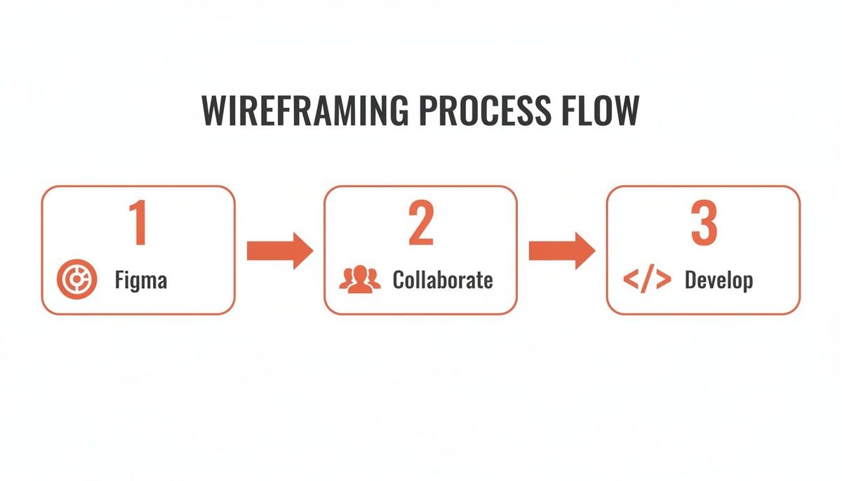
This whole process—from designing in Figma, to collaborating with users, and finally handing off a validated concept for development—is a tight, iterative loop.
This workflow isn't just a series of handoffs; it's a lean way to build products, making sure that prototyping and user feedback are baked into the process, not treated as separate afterthoughts.
The rise of low-code tools is making this cycle even faster. Gartner even predicts they'll power 75% of new app development by 2026. This shift lets startups create revenue-ready React Native prototypes, validate entire business ideas with just 10-20 users, and slash technical risk before the real build begins.
By validating your assumptions with a clickable prototype first, you're not just designing better—you're building a product people will actually need and want to use. This isn't just a best practice; it's the foundation for strong user retention and long-term success.
Creating a Smooth Handoff to Your Developers
The leap from design to development is where projects can either fly or falter. Even with a pixel-perfect wireframe, developers need more than just a picture to build a great app. A sloppy handoff creates confusion, introduces bugs, and pretty much guarantees the final product won't match your vision.
A structured, thoughtful handoff process changes everything.
Think of it this way: you’re not just giving them a blueprint; you're handing over a detailed instruction manual. This is especially true for React Native projects. When developers get clearly defined components from the start, the build process accelerates dramatically.
Beyond the Visuals: What Developers Actually Need
Your developers don't see screens; they see components, states, and logic. To bridge that gap, your wireframes and prototypes need to be annotated with the technical details they need to execute your vision.
Here are the non-negotiables to include in your handoff package:
- Detailed Annotations: Specify exact spacing (margins, padding), font sizes, and color hex codes. Never make a developer guess.
- Component States: This is the one that gets forgotten most often. Clearly define what every interactive element looks like in every possible state—default, active, disabled, hover, and error. It's the secret to a polished UX.
- Interaction Notes: Document what actually happens when a user acts. Tapping a button? Does a modal pop up? Swiping a card? Does the screen transition with a slide-in animation? Be explicit.
Actionable Insight: Create a dedicated "Handoff" page in your Figma file. On this page, lay out each component and visually display all its states side-by-side with annotations. For example, show the "Submit" button in its default blue, its grayed-out disabled state, and its red "Error" state. This visual guide is infinitely clearer than a text document.
A great handoff anticipates questions. Instead of just showing a static screen, you’re providing the full recipe for how every element looks, feels, and behaves under different conditions. That clarity is the difference between a smooth build and a frustrating one.
Using the Right Tools for the Job
Thankfully, modern design tools have made this whole process way easier.
Figma's Developer Mode is built for this. It lets engineers inspect any design element and get the exact CSS, iOS, or Android values they need. They can also export assets directly, which cuts out a ton of back-and-forth.
For even more structure, tools like Zeplin or Avocode are fantastic. You can sync your designs from Figma or Sketch, and they create a living style guide and component library for your team. It becomes the single source of truth for all design specs.
If you're a non-technical founder trying to wrap your head around this critical step, our guide to code handoff breaks down exactly what you need to know to secure your app's future.
Common Questions We Hear About Mobile App Wireframing
When you're in the trenches of planning a new app, the wireframing stage brings up a lot of practical questions. As a founder or product manager, getting clear answers is the difference between moving forward with confidence and getting stuck in the weeds.
Let's walk through some of the most common questions our team gets.
One of the first things people ask is about the right level of detail. How much is too much? The honest answer: it completely depends on your goal right now.
If you're just trying to map out a user flow for an internal discussion, keep it dead simple. We're talking basic boxes and labels. If you start adding colors or fancy fonts at this stage, you're just inviting feedback on aesthetics when you need to be focused on function. It's a classic rookie mistake that derails meetings.
But once you're prepping for user testing or getting ready to brief your developers, that detail becomes absolutely essential. At that point, your wireframes need to be precise enough to communicate spacing, component states, and how a user is actually supposed to interact with the screen.
How Do I Handle Wireframing for Both iOS and Android?
This one comes up all the time. Founders worry they'll have to do all the design work twice to support both major platforms. Should you create two totally separate sets of wireframes?
Almost never. That's a huge waste of time and money.
The smart approach is to design for one platform first. We usually start with iOS because its design patterns are often more constrained. Once you've nailed down and validated that primary user flow, you adapt it for Android.
This "adapt, don't duplicate" strategy is all about swapping out platform-specific UI elements, not reinventing the wheel. For instance:
- Navigation: What's a tab bar in iOS might become a bottom navigation bar or a hamburger menu on Android.
- Back Buttons: iOS apps have that standard back button in the top-left corner. Android users are used to a system-level back gesture or button.
- System Modals: Alerts and pop-ups look and feel different on each platform. Respecting that makes your app feel native, not like a cheap port.
The core user flow and information architecture should remain 90% the same across both platforms. The tweaks are all about respecting native conventions so the app feels at home on each device. You aren't redesigning the entire experience.
Actionable Insight: In your wireframe, create a simple checklist for Android adaptation. For each key screen, note which iOS-specific components need to be swapped for their Android equivalent (e.g., "Change top-left back arrow to use system back button," or "Replace iOS date picker with Android's Material Design version"). This keeps adaptation systematic and prevents anything from being missed.
By focusing on a single, solid user flow and then adapting the key components, you stay lean. You avoid getting bogged down in redundant work and keep the focus where it should be: building an intuitive experience for your users, no matter what phone they're using.
Ready to turn those wireframes into a revenue-generating mobile app? At Vermillion, we partner with funded startups to build and launch React Native apps that prove traction and deliver ROI, fast. Let's build your app.