Product Market Fit Metrics: A Quick Look at product market fit metrics

Product market fit metrics are the vital signs that tell you customers don't just like your product—they need it. They're the hard numbers that replace gut feelings with objective proof that people are sticking around, paying for what you've built, and telling their friends.
Without them, you’re just flying blind.
Why Product Market Fit Metrics Matter
Let's be real. "Product market fit" is a fuzzy, almost mythical concept. Founders are told to chase it, often described with feelings like, "you'll know it when you feel the market pulling the product from you."
But feelings don't convince investors to write a $5M check. They don't tell your engineers which feature to build next. And they certainly don't tell you when to pour gasoline on your marketing fire. This is where product market fit metrics come in, turning a vague idea into something you can actually measure.
Think of these metrics as a ship’s navigation system. An old sea captain might have a "gut feeling" for the right direction, but they still rely on a compass, GPS, and sonar to make precise, life-or-death decisions. Your startup needs that same level of objective data to know the difference between a few curious tire-kickers and the kind of sticky engagement that builds a real business.
From Vague Hunches to Actionable Insights
Relying on intuition alone is a high-stakes gamble. You might see a big spike in sign-ups and think you've struck gold, only to realize 95% of those users disappear within a week. You could spend three months building a killer new feature your team loves, but that your customers never even touch.
PMF metrics are your defense against these costly mistakes. They give you a brutally honest picture of what users are actually doing, not what you hope they're doing.
They help you answer the most critical questions with real data:
- Are new users "getting it" and finding value right away? (Activation Rate)
- Is our product a leaky bucket, or do customers stick around for the long haul? (Retention Cohorts)
- Are our users so thrilled they're becoming our sales team? (Net Promoter Score)
- Can this business actually make money as we grow? (LTV/CAC Ratio)
By tracking the right numbers, you turn subjective hunches into an objective dashboard for your company's health. This data-driven clarity is the bedrock of confident decision-making, from prioritizing your product roadmap to scaling your team.
Getting these numbers right is non-negotiable for fundraising. Investors have seen hundreds of pitches, and they're looking for hard proof that you've built something people truly need.
Before we dive deep into each one, here's a quick overview of the metrics we'll be breaking down. Think of this as your cheat sheet for proving you've moved beyond a good idea and are on your way to building a durable business.
Your Product Market Fit Metrics Cheat Sheet
| Metric | What It Measures | Why It's Critical for PMF |
|---|---|---|
| **Retention Cohorts** | If users from a specific week/month keep coming back over time. | Shows if your product has long-term value, not just novelty. The ultimate sign of stickiness. |
| **NPS / SMR** | How likely users are to recommend your product to others. | Measures user love and word-of-mouth potential. A leading indicator of organic growth. |
| **Activation Rate** | The percentage of new users who complete a key "aha moment" action. | Proves users are finding the core value of your product quickly. Fixes the "leaky bucket" top. |
| **DAU/MAU Ratio** | The proportion of monthly active users who return on a daily basis. | Gauges the intensity and frequency of engagement. How habitual is your product? |
| **Churn Rate** | The rate at which customers stop using or paying for your product. | Measures how many users you're losing. High churn kills growth and signals a value gap. |
| **LTV/CAC Ratio** | The lifetime value of a customer versus the cost to acquire them. | Determines if your business model is financially sustainable. The core of a scalable business. |
| **Growth Rate** | The week-over-week or month-over-month increase in a key metric. | Shows market pull. Consistent, high growth is the clearest signal that you're onto something big. |
| **Paid Conversion** | The percentage of free or trial users who become paying customers. | Validates that the value you provide is worth paying for. The ultimate proof of value. |
| **Engagement Depth** | How many core features a user interacts with per session. | Indicates how deeply users are integrating your product into their workflow or life. |
Throughout this guide, we’ll unpack each of these metrics one by one. We'll show you exactly how to calculate them, what good benchmarks look like for a startup at your stage, and most importantly, what to do when the numbers aren't telling you the story you want to hear.
Mastering the Core Quantitative Metrics
While your gut can point you in the right direction, numbers don't lie. Quantitative metrics are the hard evidence that your product is actually hitting the mark with your audience, turning abstract user behavior into a dashboard you can act on.
These metrics tell you more than just if people are showing up. They tell you if they're sticking around, if they're finding real value, and if they're becoming a core part of your ecosystem.
Below is a map of how these numbers directly connect your product’s performance to the stuff that really matters: growth, smarter decisions, and your ability to raise money.
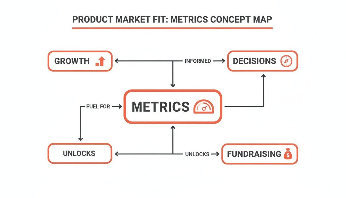
This isn't just about tracking for tracking's sake. Mastering your metrics fuels your growth engine, helps you make better product bets, and gives you a much stronger hand when you're talking to investors. Let's dive into the four pillars of this analysis.
Unpacking Retention Cohorts
Retention is probably the single most powerful signal of product-market fit. It answers one simple but brutal question: are people coming back?
A retention cohort analysis is how you get the answer. You group users by when they signed up (like everyone from the first week of March) and then track what percentage of that group is still around in the following weeks and months.
Think of it like opening a new restaurant. If a thousand people show up on opening night but only a handful ever come back, you don't have a business—you just had a flash-in-the-pan novelty. Strong retention is proof that your product offers lasting value, not just a gimmick.
The goal is to see your retention curve flatten out over time. A curve that drops to zero means you have a "leaky bucket." But a curve that stabilizes means you've found a core group of users who can't imagine their lives without you. That's the bedrock of a healthy business.
Practical Example & Actionable Insight:
Imagine you use a tool like Amplitude and see that your March cohort's retention flattens at 25%, while your April cohort's flattens at only 15%. This is a huge red flag. The actionable insight is to investigate what changed between March and April. Did you ship a confusing new feature? Did your marketing target a different, less ideal customer segment? By comparing cohorts, you can pinpoint the exact cause of a drop in long-term value and either roll back the change or improve user education.
Measuring the Activation Rate
The Activation Rate tells you what percentage of new users actually experience your product's core value—that "aha moment" you designed. This isn't just about them signing up; it's about them taking that first critical action that gets them hooked.
For a social media app, this might be adding five friends. For a project management tool, it could be creating their first task. A low activation rate is a massive red flag. It means users are getting lost, feeling overwhelmed, or just not seeing the value you promised on your landing page.
Practical Example & Actionable Insight:
A SaaS tool for designers defines activation as "exporting their first design." They see a low activation rate of 20%. By using a session recording tool, they discover that 60% of new users drop off when asked to import assets from scratch. The actionable insight is to create a pre-populated template gallery. This allows new users to simply choose a template, make a small tweak, and hit "export" within minutes, experiencing the core value immediately. This simple change could dramatically lift their activation rate.
Among all the numbers you'll track, understanding key customer retention metrics is what separates founders who think they have PMF from those who know they do. A high activation rate is the first step on that journey.
Calculating the DAU/MAU Ratio
The DAU/MAU Ratio (Daily Active Users divided by Monthly Active Users) is a simple but potent measure of stickiness. It tells you what percentage of your monthly users come back every single day. For products designed for frequent use—like social, communication, or productivity apps—this metric is gold.
- Formula: (Daily Active Users / Monthly Active Users) x 100
- B2C Benchmark: A ratio over 20% is considered pretty good, while top-tier apps like Facebook often blow past 50%. If you're hitting >35%, you're in a very strong position.
- B2B Benchmark: This is less critical for B2B SaaS that isn't built for daily use (think accounting software). But for tools like Slack or Asana, it's a vital health indicator.
A high DAU/MAU ratio means your product has become a habit. It’s not just something people use occasionally; it’s woven into their daily lives.
Practical Example & Actionable Insight:
A mobile meditation app notices its DAU/MAU ratio is stuck at a mediocre 15%. They see that users who set a daily reminder notification have a 40% DAU/MAU ratio. The actionable insight is to redesign the onboarding flow to actively encourage users to set a daily reminder on day one, explaining it as the "best way to build a consistent practice." This small, targeted push can turn a nice-to-have app into a daily ritual, directly boosting its stickiness.
Monitoring the Churn Rate
Finally, there's Churn Rate, the percentage of customers who stop using or paying for your product over a given period. This is the ultimate anti-PMF metric. It doesn't matter how fast you're acquiring new users; if your churn is high, you're just pouring water into a leaky bucket.
You need to track two types of churn:
- User Churn: The percentage of your total users who disappear.
- Revenue Churn: The percentage of your monthly recurring revenue (MRR) that you lose.
For B2B SaaS startups, a healthy monthly revenue churn rate should be under 2%. Anything higher signals a fundamental mismatch between the value your product promises and what it actually delivers. It's a clear sign you need to go back to the drawing board before you even think about scaling.
Practical Example & Actionable Insight:
A subscription box company has a high 10% monthly churn. When they analyze exit surveys, a common complaint is "I have too many products." The actionable insight is to introduce a "skip a month" feature. This gives customers flexibility without forcing them to cancel entirely. This single feature could significantly reduce churn by retaining customers who are temporarily overstocked but still love the service, turning a cancellation into a pause.
Turning User Love into Hard Data
Retention curves and churn rates are great for telling you what your users are doing. But they’re silent on the why. Numbers alone can’t capture the passion that makes someone rave about your product, or the frustration that makes them delete it. This is where you have to bridge the gap and turn those feelings of "user love" into a concrete roadmap.
To really know if your product is a must-have, you have to listen—systematically. Metrics like the Net Promoter Score (NPS) and the Sean Ellis Test go beyond simple usage data. They measure loyalty and dependency directly, connecting the emotional response to your business goals.

Unpacking the Net Promoter Score (NPS)
The Net Promoter Score is a brutally simple, yet incredibly powerful way to measure customer loyalty. It all comes down to one question: "On a scale of 0-10, how likely are you to recommend our product to a friend or colleague?"
Based on the number they pick, users fall into one of three camps:
- Promoters (9-10): These are your true fans. They're the ones driving your word-of-mouth growth.
- Passives (7-8): They're satisfied, but not thrilled. They like your product well enough, but they're easily swayed by a competitor’s shiny new offer.
- Detractors (0-6): These are your unhappy campers. They can actively harm your brand with bad reviews and negative feedback.
To calculate your NPS, you just subtract the percentage of Detractors from the percentage of Promoters. While the score is a handy benchmark, the real magic is in the follow-up question: "What is the primary reason for your score?"
The answers to that second question are pure gold. Promoter feedback tells you exactly what your product's "magic moment" is—the core value that hooks people. On the flip side, Detractor feedback puts a giant spotlight on your biggest problems, showing you exactly where you need to improve to stop users from leaving. For a deeper dive, check out our guide on how to reduce customer churn.
Practical Example & Actionable Insight:
A project management tool gets a decent NPS score of 40, but the qualitative feedback is revealing. The Promoters all rave about the "timeline visualization feature." The Detractors, however, consistently complain that "integrating with our calendar is a nightmare." The actionable insight is clear: double down on what works and fix what's broken. The product team's next sprint should be dedicated to rebuilding the calendar integration, while the marketing team should highlight the timeline feature in all their campaigns to attract more ideal users.
The Sean Ellis Test: The 40% Rule
While NPS is about loyalty, the Sean Ellis Test is all about dependency. It cuts right to the heart of product–market fit by asking one simple, powerful question: "How would you feel if you could no longer use this product?"
Users get three choices:
- Very disappointed
- Somewhat disappointed
- Not disappointed
According to Ellis, the benchmark is clear: if 40% or more of your users say they would be "very disappointed," you've got a strong signal of product–market fit. It means you’ve built something essential for a core group of people, not just a nice-to-have vitamin.
Practical Example & Actionable Insight:
A startup building a tool for remote teams runs the test and gets a score of 30%—just shy of the 40% goal. They segment the results and find a fascinating pattern: users who have integrated the tool with Slack are hitting a 55% "very disappointed" score. The actionable insight is that the Slack integration is the key to making the product indispensable. Their new priority becomes driving every single new user to connect Slack during onboarding, effectively guiding them toward the stickiest version of the product experience.
This iconic 40% test has been battle-tested across thousands of startups. Hitting this number often correlates with a 10x outperformance in retention because it proves you've built something indispensable. You can find more on how this metric has been validated over time on UserVoice.com.
How to Run Surveys That Actually Work
Getting honest feedback is an art. If you just blast your entire user base with a survey, you’ll get a ton of noise and very little signal. Timing, targeting, and phrasing are everything.
The goal of a PMF survey isn't just to collect data—it's to spark a conversation with your most engaged users. You want to understand their world so deeply that you can build the product they can't live without.
Here are a few tips to get real, actionable insights:
- Target the Right Users: Don’t survey someone who just signed up. They haven't had time to experience your product's real value. Instead, focus on users who have finished onboarding, used the app at least twice, and have been active for a couple of weeks.
- Ask at the Right Time: Nothing kills a good user experience like a random survey popup. A much better approach is to trigger the survey via email after they’ve completed a key action or hit a milestone in your app.
- Keep It Simple and Unbiased: Stick to the proven, single-question format for both NPS and the Sean Ellis Test. Don't ask leading questions or offer incentives that could mess with the results. The goal here is raw honesty, even if it stings a little.
Turning Passion Into Profit
Having users who love your product is a great first step, but it doesn't automatically mean you have a business. Metrics like NPS and retention tell you if you've built something people want, but they don't tell you if you've built something that can last.
This is where the rubber meets the road. We need to connect user engagement to the bottom line, and the single most important metric for that is the LTV/CAC ratio. It answers the one question every investor and founder needs to know: for every dollar we spend to get a new customer, how many dollars do we get back?
Calculating Customer Acquisition Cost (CAC)
Your Customer Acquisition Cost (CAC) is the total price you pay to get one new customer in the door. The biggest mistake founders make here is thinking it’s just ad spend. To get a real number, you have to include everything.
- Marketing & Ad Spend: All the money for Google Ads, social media campaigns, content, etc.
- Salaries: The cost of your marketing and sales teams. Yes, their entire salaries count.
- Tools & Software: Your CRM, marketing automation platforms, analytics tools—it all adds up.
- Overhead: Any other related costs that go into the hunt for new customers.
The formula is simple: Total Sales & Marketing Costs / Number of New Customers Acquired
So, if you spent $50,000 in a quarter and brought in 500 new customers, your CAC is $100.
Calculating Lifetime Value (LTV)
On the other side of the coin is Customer Lifetime Value (LTV). This number predicts the total revenue you can expect from a single customer before they leave. LTV tells you what a customer is truly worth over the long haul, which dictates how much you can responsibly spend to get them.
Calculating LTV can feel a bit like looking into a crystal ball, since it relies on past data to predict the future. For a SaaS business, a straightforward way to calculate it is:
LTV Formula: Average Revenue Per Account (ARPA) / Customer Churn Rate
Imagine your average customer pays $50/month (your ARPA) and your monthly churn rate is 5%. The math would be ($50 / 0.05), which gives you an LTV of $1,000. That means, on average, a new customer will generate $1,000 in revenue before they churn.
A critical mistake founders often make is underestimating churn. An inaccurate churn calculation will give you a dangerously inflated LTV, leading you to overspend on acquisition. To truly ensure your product has a profitable future, it's essential to continually monitor and address metrics like understanding churn in SaaS, which directly impacts your bottom line.
The 3-to-1 Gold Standard
With LTV and CAC in hand, you can finally calculate your ratio. For a healthy, scalable business, the industry benchmark is an LTV/CAC ratio of 3:1 or higher.
- 1:1 Ratio: You’re lighting money on fire. For every customer you bring in, you’re losing money.
- Less than 3:1: Your business model isn't working yet. You’re on a treadmill, struggling to turn a profit from each new user.
- 3:1 Ratio: This is the magic number. You have a solid, working business model. For every $1 you spend, you get $3 back. Investors love this.
- 4:1 or 5:1 Ratio: You've struck gold. Your model is incredibly efficient, and you should be pouring as much fuel on the fire as you can by investing more in your acquisition channels.
The real magic happens when you segment this ratio by acquisition channel. You might find your Google Ads channel has a 2:1 ratio, while your organic content delivers a stunning 7:1. That insight tells you exactly where to focus your efforts and budget. We break this down even further when exploring the relationship between customer acquisition cost vs lifetime value.
Practical Example & Actionable Insight:
A B2B software company calculates its overall LTV/CAC ratio at 2.5:1—not great. But when they segment by customer size, they find that enterprise clients have a 5:1 ratio, while SMB clients have a 1:1 ratio. The actionable insight is to pivot the entire sales and marketing strategy to focus exclusively on the enterprise segment. They might drop Google Ads targeting small businesses and instead hire a dedicated enterprise sales rep, reallocating their budget to the channel that delivers profitable, sustainable growth.
Ultimately, a strong LTV/CAC ratio is one of the most powerful signals of product-market fit. It proves you've not only built something people want, but you've also built a machine that can grow profitably.
Advanced Metrics for Fundraising and Scaling
Once you’ve nailed the foundational product-market fit metrics, it’s time to change the conversation. When you're sitting across the table from VCs or presenting to your board, they expect a more sophisticated story—one that proves you have more than just traction. They want to see a scalable, efficient growth engine.
This is where advanced metrics come in. They shift the narrative from "people like our product" to "our business model is a powerful, self-sustaining machine." These are the numbers that unlock serious funding because they signal you’re ready to scale, and scale aggressively.
The two metrics that matter most here are Net Revenue Retention (NRR) and Compound Monthly Growth Rate (CMGR).
Net Revenue Retention: The Gold Standard of SaaS
Net Revenue Retention, or NRR, is arguably the most powerful metric for a subscription business. It answers a simple but profound question: can our business grow even if we don't acquire a single new customer?
NRR tracks the total change in recurring revenue from your existing customer base over a set period. It’s a tug-of-war between expansion revenue (upgrades, cross-sells) and churned revenue (downgrades, cancellations).
A healthy NRR is the ultimate proof of a sticky product with deep value. When NRR is over 100%, it means your existing customers are spending more over time, creating a powerful "negative churn" effect that fuels growth from within.
An NRR below 100% means you’re leaking revenue; you're losing more from existing customers than you're gaining through expansion. But an NRR above 100% means your existing customer base is a growth engine in itself. This is what investors dream of seeing.
Practical Example & Actionable Insight:
A SaaS company has an NRR of 110%. They dig into the data and discover that 90% of their expansion revenue comes from customers buying more user seats as their teams grow. However, only 5% of customers have purchased their new add-on analytics module. The actionable insight is that while the core product is sticky, the cross-sell strategy is failing. The company can now create a dedicated campaign to educate existing customers on the value of the analytics module, unlocking a new, untapped revenue stream from their happiest users.
In the high-stakes world of funded startups, top performers consistently break 100% NRR. The absolute best SaaS companies hit 130% or higher. Enterprise-focused businesses often boast 130% NRR, while companies targeting SMBs might see lower rates around 85%. This metric clearly shows where product fit is rock-solid versus where it's fragile. You can learn more about how NRR signals a strong product-market fit at ITONICS-Innovation.com.
Compound Monthly Growth Rate: The True Pace of Progress
Month-over-month growth is exciting, but it can be a vanity metric. A huge spike one month followed by two flat months can hide serious problems. Investors know this, which is why they look for the Compound Monthly Growth Rate (CMGR) to understand your true, sustained momentum.
CMGR smooths out the volatile peaks and valleys of monthly growth, giving a much clearer picture of your trajectory. It reveals the steady, consistent monthly growth rate you'd need to achieve to get from your starting revenue to your ending revenue.
How to Calculate CMGR
The formula is pretty straightforward: (Latest Month's Revenue / First Month's Revenue)^(1 / Number of Months) - 1
Let's walk through an example. Imagine your MRR looks like this:
- January MRR: $10,000
- April MRR: $19,500
- Number of Months: 3 (from the end of Jan to the end of Apr)
The calculation would be: ($19,500 / $10,000)^(1/3) - 1 = 0.249, or 24.9% CMGR.
This tells a far more compelling story than just saying your revenue grew by $9,500. It shows you're growing at a steady, compoundable rate of nearly 25% per month. When you present your CMGR over 3, 6, and 12-month periods, you prove your growth isn't a fluke—it's a predictable pattern.
For a seed-stage or Series A startup, a consistent CMGR of 15-20% is a massive signal of product-market fit and genuine market pull. It demonstrates that your growth isn’t just a series of one-off wins but the result of a repeatable, scalable process. This is the kind of data-backed storytelling that separates a good pitch from a funded one.
Building Your Product Market Fit Dashboard
All the metrics we've discussed are powerful on their own, but they don't tell the full story in isolation. Their real power emerges when you see them together on a single screen. This is where a Product-Market Fit (PMF) Dashboard comes in—it transforms scattered data points into a coherent narrative about your startup's health.
You don't need a complex, expensive BI tool to get started. This can be a simple spreadsheet or a basic setup in Google Data Studio. The goal is to create one single source of truth that ties your product's real-world performance directly to your company's strategic priorities. It’s the bridge between what you want to achieve and what your teams build every day.
From Metrics to Mission Control
Think of your dashboard as the mission control panel for your startup. Each metric is a gauge telling you if a critical system is healthy. When one of those gauges starts flashing red, you know exactly where to focus. It stops the guesswork and ensures every decision is driven by what your users are actually doing.
Here’s a look at how you might lay out a basic PMF dashboard, zeroing in on the metrics that tell the most critical parts of your story:

This kind of at-a-glance view immediately shows you the health of your user base—trends in retention, activation, and sentiment. These are the vital signs for product-market fit.
Turning Dashboard Insights into Action
A dashboard that doesn't inspire action is just a vanity project. Its real value is in guiding your product roadmap and engineering sprints. This is how you stop building features based on hunches and start shipping updates that measurably move your key numbers.
Let's walk through a real-world scenario. Imagine your dashboard flags a troubling trend:
- The Problem: Your Activation Rate has flatlined at a dismal 15%. People are signing up, but they're never hitting that "aha moment" that makes them stick around.
This isn't just a random number; it's a screaming signal that your onboarding is broken. Instead of guessing what to build next, you now have a clear mission.
Your dashboard doesn’t just show you what’s wrong; it tells you what to fix next. It transforms a vague feeling of "we need more engagement" into a specific, actionable directive for your team.
Creating an Action Plan from Data
Armed with that insight, you can build a targeted plan that aligns your entire team around a single, measurable objective. The goal is no longer a fuzzy "improve the product" but a concrete "increase the Activation Rate from 15% to 30% this quarter."
Here’s what that looks like in practice:
- Hypothesis: Users are churning because the initial setup is too complex and they don't see the core value fast enough.
- Product & Engineering Task: Kill the long, multi-step onboarding form. Replace it with a short, interactive tutorial that guides new users to perform one critical action that delivers immediate value.
- Success Metric: Track the completion rate of this new tutorial and watch its direct impact on the overall activation rate.
When you connect your PMF metrics directly to your development cycle, every line of code starts to serve a strategic purpose. Your team isn't just shipping features anymore; they're systematically eliminating the biggest roadblocks to your growth. It's this disciplined, data-first approach that closes the gap between a promising product and a scalable business.
To get a head start, you can explore some of the best analytics tools for mobile apps that can power a dashboard like this.
Your PMF Metrics Questions, Answered
Tracking product-market fit metrics can feel like you're staring at a dashboard full of blinking lights. Let's cut through the noise and answer the questions that come up most often when founders start putting this theory into practice.
How Often Should I Be Looking at This Stuff?
This really depends on how early you are. For seed-stage startups, you should be living in your metrics dashboard. Key numbers like activation and retention need to be checked weekly. At this stage, you’re moving fast and breaking things, and a weekly cadence lets you see if your experiments are working or if you’ve sprung a new leak in the hull.
Once you’re more established—think Series A and beyond—and have a stable user base, you can often pull back to a monthly review. This helps you see the forest for the trees, focusing on bigger trends instead of getting whiplashed by daily or weekly fluctuations.
If I Can Only Track One Metric, What Should It Be?
If I had to pick just one, it would be retention. Hands down.
It’s the ultimate signal that you've built a painkiller, not just a vitamin. A flattening retention curve is the clearest proof you can get that a core group of users finds your product indispensable. They tried it, they liked it, and they're not leaving.
That said, the real "most important" metric is always tied to your business model. For a free social app fighting for attention, DAU/MAU might tell a more urgent story. For a B2B SaaS company, Net Revenue Retention (NRR) is often the holy grail.
Your best bet is to define a "North Star Metric"—a single number that best captures the core value your users get. All your other PMF metrics should then serve to explain why that North Star is moving up or down.
Is It Possible to Have Product-Market Fit with High Churn?
Almost never. High churn is the definition of a "leaky bucket," and it's a massive red flag.
You might have explosive top-of-funnel growth, but if you're losing users just as fast as you acquire them, you're on a treadmill to nowhere. It means there's a fundamental disconnect between the promise you're selling and the value you're actually delivering.
While some massive-scale B2C markets can sometimes tolerate higher churn by just out-acquiring it, for 99% of startups, high churn is a clear sign that you haven't truly found product-market fit yet.
At Vermillion, we help founders turn these numbers into a clear, actionable roadmap. If you need a technical partner to translate your metrics into scalable growth, we should talk. Learn more at https://vermillion.agency.