Vermillion Insights
January 6, 2026 · Ken Vermeille · 17 min read
How to Increase User Retention: Practical Tips to Engage and Retain Users
How to increase user retention with proven onboarding and engagement strategies that boost loyalty and active usage.
Let's be blunt: most apps are bleeding users. Founders love to celebrate download numbers, but the real killer is the leaky bucket of people who install your app and never come back. Retention isn't just another KPI; it's the engine of growth. It's what decides if you're building a business or just a forgotten icon on someone's home screen.
The numbers are pretty brutal. Imagine launching your shiny new app only to find out that 75% of your users are gone by the end of Day 1. That’s not a worst-case scenario; it's the harsh reality for the average app. Industry benchmarks put the global Day 1 retention rate at just 25%. Three-quarters of your hard-won downloads vanish almost immediately.
If you want to dig deeper, we've broken down more of these critical app user retention statistics.
From Hunting Downloads to Building Loyalty
That immediate drop-off points to a massive flaw in most growth strategies. Pouring money into user acquisition without a solid retention plan is like filling a bucket riddled with holes. You can burn through your marketing budget, but if users don't stick around, you'll never see a return on your customer acquisition cost (CAC).
The apps that win aren't just acquiring users; they're creating loyal fans. That shift happens the moment you stop treating retention as a feature you'll "get to later" and start baking it into your product's DNA from the very first line of code.
Instead of chasing vanity metrics, the real goal is to build something that delivers real, ongoing value. This guide is a practical framework for doing just that - moving past the buzzwords and into the trenches with actionable tactics that build loyalty and drive up lifetime value (LTV). We'll cover everything from diagnosing your app's leaks with data to designing a killer first-time experience and building powerful engagement loops that keep people coming back.
To give you a quick lay of the land, the table below outlines the core pillars we're about to break down. Think of it as your roadmap for turning casual users into dedicated advocates.
The Four Pillars of User Retention
| Pillar | Objective | Key Tactics |
|---|---|---|
| Data-Driven Diagnosis | Pinpoint exactly where and why users are dropping off. | Cohort analysis, funnel visualization, user segmentation. |
| First-Time Experience | Get users to their "Aha!" moment as quickly as possible. | Streamlined onboarding, clear value proposition, quick wins. |
| Engagement Loops | Build habits that make your app an indispensable part of their routine. | Smart notifications, personalization, gamification, social features. |
| Optimization & Iteration | Continuously improve retention through structured experimentation. | A/B testing, user feedback loops, KPI tracking. |
Each of these pillars builds on the last. By the end of this guide, you'll have a complete system for not just plugging the leaks in your bucket, but turning it into a well that never runs dry.
Find and Fix Your App's Leaks with Data
To have any chance at boosting user retention, you have to become a detective. Just saying "we have high churn" is useless. It’s too vague. You need to pinpoint exactly where your app is leaking users and, more importantly, why. This all starts with turning raw user data into a clear map of your problems.
The single most powerful tool for this is cohort analysis. Think of it like grouping your users into "graduating classes" based on when they signed up - say, everyone who joined the first week of May. By tracking each of these cohorts over time, you can see how their engagement changes and, crucially, compare different groups against each other.
This approach turns a fuzzy problem into a very specific one. You might discover that users from a recent marketing campaign churned twice as fast as your organic signups. Or maybe that new feature you shipped in June lines up perfectly with a steep drop in Day 7 retention for that month's cohort. Now you have something concrete to investigate.
Uncover Trends with Cohort Analysis
Cohort analysis is your best friend for understanding retention patterns that go way beyond simple daily or monthly active user counts. It helps you answer the real questions, like, "Are we actually getting better at keeping users over time?" or "Did our last app update improve or hurt long-term engagement?"
This chart illustrates just how brutal the initial user journey can be, with the biggest drop-off often happening within the first day.
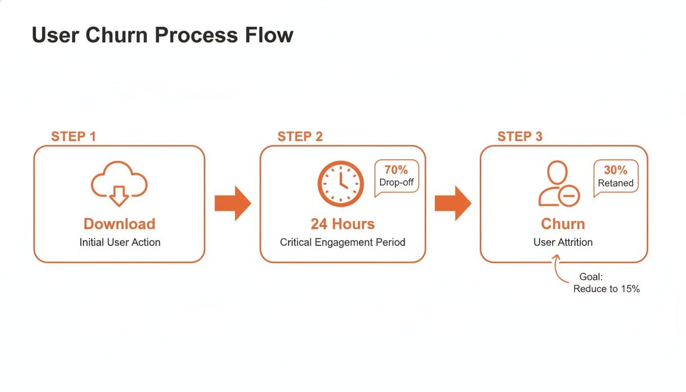
This visual just hammers home how short that journey from download to churn can be. It's why getting your early-stage analysis right is a matter of survival.
To actually do this, you'll need the right tools. Platforms like Amplitude, Mixpanel, and PostHog are built for this exact kind of analysis, letting you segment users and build these charts without needing to write complex SQL. If you're still figuring out your stack, this guide on the best analytics tools for mobile apps can help you find a good fit for your startup.
Map the User Journey with Funnel Analysis
While cohort analysis shows you when users are leaving, funnel analysis shows you where. This technique maps out the critical steps a user needs to take to get to that "Aha! Moment" and immediately highlights the biggest drop-off points along the way.
Practical Example: For a marketplace app, a critical funnel might look something like this:
- Signed Up: 100% of users start here.
- Searched for a Product: 85% make it this far.
- Added Item to Cart: Only 50% complete this step.
- Initiated Checkout: A mere 20% of users proceed.
- Completed Purchase: Just 10% of the initial group finishes the job.
This funnel reveals a massive 60% drop-off between adding an item to the cart and starting the checkout process. That’s not just a leak; it's a waterfall. Instead of a vague "churn" problem, you now have a specific, solvable issue: "Why are users abandoning their carts?"
Actionable Insight: This single data point gives your team a crystal-clear target. You can now form hypotheses and test solutions. Is the shipping cost a nasty surprise? A/B test showing shipping estimates earlier. Is the "Checkout" button buried? Test a more prominent design. Is there a required field causing friction? Try removing it. Nailing down these friction points is everything, and this proven guide to retaining SaaS customers offers more depth on turning these data points into action.
By combining cohort and funnel data, you stop guessing and start knowing. Your entire retention strategy shifts from being reactive to proactive, which is exactly where you need to be.
Craft a Memorable First User Experience
You get one shot at a first impression. In the app world, that first interaction is incredibly fragile. We're talking minutes, maybe even seconds, before a user decides whether your app is a keeper or gets tossed into the digital graveyard.
A confusing or aimless first session is a surefire way to kill your retention before it even has a chance to breathe. This makes your onboarding flow one of the single most important things you'll build.
The goal isn't to give a lengthy tour of every single feature. It's about getting the user to their personal "Aha! Moment" as fast as humanly possible. This is that magic instant where they truly get your app's value and think, "Oh, I see. This is actually useful."
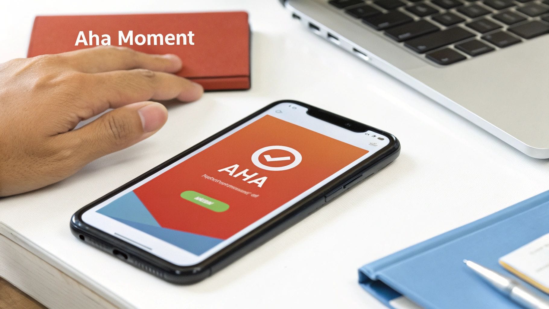
This moment is different for every app. For a music app, it might be when they create their first playlist and discover a new song they love. For a fintech app, it's often the second they link their bank account and see their finances neatly organized.
Your primary job during onboarding is to ruthlessly eliminate every distraction and point of friction standing between a new user and that "Aha! Moment." Every screen, every prompt, every tap must serve that one singular purpose.
Identify Your App’s Core Value Proposition
Before you build a single screen, you have to be crystal clear on what that "Aha! Moment" actually is. This isn't about your feature list; it's about the one key action that delivers on the promise you made in the app store.
To nail it down, ask yourself these questions:
- What’s the single most important action a user can take to solve their problem? For a task manager, it's creating and checking off their first to-do item.
- If a user could only do one thing in their first session, what would it be? For a social app, maybe it’s connecting with their first friend.
- What action best demonstrates our unique value? For a language app, it could be acing their first quick, interactive lesson.
Once you’ve defined this core action, your entire onboarding experience should be reverse-engineered to get users there with the least amount of effort. Everything else can wait.
Design an Onboarding Flow That Guides, Not Overwhelms
A classic rookie mistake is hitting the user with a five-screen carousel explaining every bell and whistle. This comes from the flawed assumption that people want to learn about your app. The hard truth? They just want to solve their problem. Your app is simply the tool.
Instead of a generic tour, embrace the principle of progressive disclosure. This just means you reveal information and features only when they become relevant to what the user is trying to do right now. It respects their time and prevents cognitive overload, making the whole experience feel intuitive, not like homework.
Practical Example: A budgeting app:
- Bad Onboarding: A five-screen tour explaining the "Reports" tab, the "Goals" feature, and "Investment Tracking" before the user has even connected a bank account. It's overwhelming and irrelevant at this stage.
- Good Onboarding: The app focuses only on getting the user to link their bank account. The second they do, it shows a simple chart of their spending. That’s the first win. Only then does a small, contextual tooltip pop up, pointing to the "Categories" feature to help them organize those expenses.
Actionable Insight: This approach transforms the first session from a passive lecture into an active, rewarding experience. It builds momentum and gives the user an immediate sense of accomplishment.
Turn Empty States into Opportunities
Empty states - the screens a user sees before they've added any content - are often a complete afterthought. But for a new user, they are some of the most critical screens in your app. Instead of a blank page with a sad "No data yet" message, use this prime real estate to guide them to their first meaningful action.
Practical Example: A project management app's main dashboard.
- Bad Empty State: A blank white screen with the text "You have no projects."
- Good Empty State: An encouraging message ("Let's get organized!"), a simple illustration of a completed project, and a large, prominent button that says "+ Create Your First Project."
Actionable Insight: Use your empty states to:
- Educate Briefly: Use a short, friendly message explaining what the feature does and why it's valuable.
- Direct Clearly: Include a big, obvious call-to-action (CTA) button that kicks off the main action for that screen.
- Show, Don't Just Tell: A simple illustration or icon can make the screen more engaging and quickly communicate its purpose.
By optimizing these neglected screens, you create a continuous, guided path that prevents people from getting stuck and bouncing.
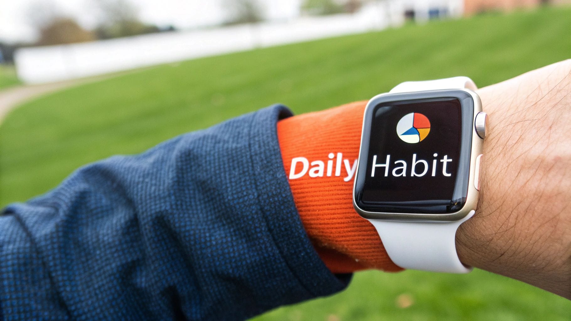
Build Habits with Smart Engagement Loops
Getting users to stick around isn't about one big, shiny feature. It’s about making your app a reflex. Sustainable retention comes from weaving your app into a user's daily routine, and that means building powerful habits. The most effective way to do this is through smart engagement loops - a cycle of triggers, actions, and rewards that turns casual users into die-hard fans.
The psychology here is pretty straightforward. Frameworks like Nir Eyal's Hook Model break it down: a habit forms when a user goes through a cycle of a trigger (a cue), an action (what you want them to do), a variable reward (a satisfying result), and an investment (a small effort that sets up the next trigger). Your job is to engineer these loops right into your core experience.
When you get this right, your app stops being something users have to remember to open. It becomes something they open almost automatically. Let's dig into how you can build each part of this cycle.
Master the Art of the Trigger
Triggers are the spark. They're what gets the user to act, and they come in two flavors: external and internal. External triggers are the pings and notifications you send. Internal triggers are the user's own feelings or routines - like feeling bored and opening TikTok. The goal is to use your external triggers to build those powerful internal ones over time.
This is where most apps drop the ball. They bombard users with generic, spammy notifications begging them to "Come back!" That’s a fast-track to getting your notification permissions turned off for good.
A great trigger delivers immediate, personalized value. It’s not an interruption; it’s a helpful nudge that feels like it was designed just for that user, at that exact moment.
To craft notifications that actually work, you need to nail three things: timeliness, personalization, and actionable content. For a deeper dive, check out these **push notification best practices** that get into the weeds on effective messaging.
Practical Example: A retail app.
- Bad Trigger: A generic push notification sent at 2 PM on a Tuesday saying, "Don't miss our new arrivals!" It’s impersonal and probably irrelevant.
- Good Trigger: A personalized alert: "The running shoes you saved are now 20% off and back in your size." This is timely, personal, and genuinely valuable.
Actionable Insight: Don't just send notifications; send signals. Use user behavior data (items viewed, cart additions, wishlists) to trigger messages that solve a problem or offer a clear benefit.
Engineer Compelling Variable Rewards
The next piece of the puzzle is the reward. Not just any reward, though - a variable one. Predictable rewards get boring. It’s the unpredictability that keeps our brains hooked and coming back for more. It’s the same reason scrolling through a social media feed is so addictive; you never know what gem you'll find next.
Gamification is one of the best ways to bake variable rewards into your app.
Practical Example: A fitness app.
- Streaks: Maintaining a daily workout streak is a powerful motivator. Nobody wants to "break the chain," which gets them to open the app even when they don't feel like it.
- Badges and Achievements: Unlocking a new badge for hitting a milestone (like running your first 5K) delivers a satisfying hit of accomplishment.
- Leaderboards: A little friendly competition can be a huge driver, pushing users to climb the ranks.
Actionable Insight: Start small with gamification. You don't need a complex system. Implement a simple "streak" counter for a core daily action in your app. This alone can significantly increase daily active users by tapping into the user's desire for consistency and achievement.
Foster Stickiness with Social Investment
The final step in locking in the habit is investment. This is when the user puts something of value into the app - their time, data, effort, or social capital. This not only makes the app more valuable to them personally, but it also dramatically increases the odds they'll return.
Building social features is one of the strongest forms of investment because it creates powerful network effects. When an app gets better as more friends join, it becomes incredibly sticky. It's a lot harder to leave a platform where all your friends are.
Practical Example: A music streaming app.
- Activity Feeds: Seeing what your friends are listening to on Spotify or what workouts they just crushed on Strava creates a shared experience and a reason to check back in.
- Collaborative Playlists: In Spotify, a user who creates a collaborative playlist with friends has invested both time and social connection. Leaving the app means losing that shared creation.
- Following and Connections: When a user spends time building their network on LinkedIn or Twitter, they’re creating a valuable asset they don’t want to abandon.
Actionable Insight: Encourage one simple social action during onboarding. Prompting a new user to "Share your first project with a teammate" or "Find 3 friends" immediately increases their investment in the platform and demonstrates its collaborative value.
By thoughtfully designing these three components - valuable triggers, compelling rewards, and meaningful investments - you can stop just hoping for retention and start engineering it into the fabric of your product.
Monetize Your App Without Losing Users
Asking a user to pay is the moment of truth. Get it wrong, and you don't just lose a sale - you lose the user for good. Monetization isn't about throwing up frustrating roadblocks. It’s about presenting a natural, compelling upgrade that feels like the obvious next step for someone who already loves what you've built.
The secret is timing. Ask for money too soon, before they've had that "aha!" moment, and your paywall feels like a greedy cash grab. Wait too long, and they’ll get so comfortable with the free version they'll never see a reason to pay.
Your mission is to present the offer at the absolute peak of their intent.
Find the Perfect Moment to Introduce a Paywall
The best time to ask for a subscription is right after the user has successfully completed a core action and felt a real win. This is when they're most engaged and can clearly see the value your app delivers.
Practical Example: A project management app shouldn't slam a user with a paywall right after signup. That's just rude. The ideal moment is after they've created their third project and invited a team member. At this point, they're invested. They get the workflow. A prompt to upgrade for unlimited projects feels like a logical next step, not a sudden barrier.
Actionable Insight: Use in-app event tracking to trigger your paywall. Instead of showing it after 7 days, trigger it after a user has performed a specific "high-value" action three times. This ensures the offer is always relevant to their engagement level.
Freemium Versus Free Trial: Which Model Fits?
Picking the right monetization model is make-or-break for retention. The two heavy hitters, freemium and free trial, serve very different apps and user behaviors.
- Freemium Model: This is the go-to for apps that thrive on network effects or have a massive user base, like consumer social or collaboration tools. Think Slack or Spotify. The free tier is a powerful acquisition engine, letting users experience the core product forever. Monetization comes from power users who eventually need advanced features.
- Free Trial Model: This often works better for productivity or utility apps where the value is immediate and focused. A 14-day or 30-day trial for a video editing app or a CRM gives users full access to see if it truly fits their workflow. The ticking clock creates a bit of urgency, pushing engaged users to make a decision.
There's no one-size-fits-all answer here. Your choice has to align with how users actually get value from your product. A deeper dive into these strategies can help you pick the right fit for your app - you can learn more by reading our complete guide on how to monetize a mobile app.
Design Paywalls That Communicate Value
A paywall shouldn't be a boring list of features next to a price tag. It’s a sales page, and it needs to sell the benefit of upgrading. Use social proof, highlight the top one or two game-changing benefits, and make the call-to-action impossible to misunderstand.
Practical Example: Instead of a vague button that says "Get Premium," try something benefit-driven like "Unlock Unlimited Projects" or "Collaborate With Your Team." This connects the upgrade directly to what the user is trying to accomplish right now.
Your paywall should answer one simple question for the user: "How will paying for this make my life better?" If you can't answer that in a split second, your conversion rate will suffer, and you'll churn users who might have otherwise paid.
Handle Payment Issues Gracefully
Even with a perfect strategy, payments fail. Credit cards expire, subscriptions lapse, and users cancel. How you handle these moments can be the difference between losing a customer and winning them back for the long haul.
This is where subscription management tools are worth their weight in gold.
A dashboard view from a tool like RevenueCat gives you a clear, real-time picture of your app's financial health. You can see active trials, new subscriptions, and monthly recurring revenue at a glance.
Actionable Insight: By tracking these metrics, you can spot churn risks before they become a problem. When a payment fails, don't just lock the user out. Send a friendly in-app message or a simple email explaining the issue and giving them a one-tap link to update their payment info. This kind of graceful handling (known as "dunning management") can recover a huge percentage of what would otherwise be lost revenue and lost users.
Your Tactical 90-Day Retention Roadmap
Great strategy is useless without execution. This is where most retention efforts die a quiet death - in the gap between the whiteboard and the real world.
So, let's get tactical. Instead of trying to boil the ocean, we're going to break this down into a concrete, 90-day plan. It’s a roadmap designed to deliver measurable wins quickly, building momentum as you go.
This plan is built on three 30-day sprints, each with a crystal-clear focus and KPIs to prove you’re moving the needle. A plan like this works best when it incorporates proven, actionable SaaS customer retention strategies that build long-term habits.
Month 1: The Diagnostic Phase
Your first 30 days are about becoming a data detective. You can't fix a leak you can't find. The goal here isn’t to fix anything yet - it’s to get a painfully clear, data-backed picture of exactly where, when, and why users are leaving.
Your mission is to go from a vague feeling of "our churn is high" to a specific problem statement like, "We lose 45% of new users between signup and creating their first project." This initial work is everything; it ensures the next 60 days are spent on the right things.
- Instrument Your Analytics: First things first, make sure your analytics tools - whether it's Amplitude, Mixpanel, or something else - are actually tracking the right events. Garbage in, garbage out.
- Define Your Core Metrics: What does "good" look like? Establish your baseline for Day 1, Day 7, and Day 30 retention. No hiding from the numbers.
- Run Cohort Analysis: Pull user cohorts from the last 3-6 months. Are users from June sticking around longer than users from March? Where are the biggest drop-offs happening?
- Build Your Activation Funnel: Map out the critical path from the moment a user signs up to the moment they experience that "Aha! Moment." This is where you'll find the friction.
A good goal for this month is to identify the top 3 drop-off points in your user funnel. A great KPI would be, "Reduce signup-to-profile-completion drop-off by 20%."
Month 2: The First Experience Fix
Now that you know where the leaks are, Month 2 is all about fixing the biggest one: the first-time user experience (FTUE). Hands down, a killer onboarding flow is the single highest-leverage thing you can do to improve long-term retention.
This month is all about rapid experimentation. You’ll be running A/B tests to see what helps new users "get it" as fast and painlessly as possible.
- Redesign Onboarding: Armed with your data from Month 1, design and build at least two new onboarding flows to test against your current one.
- A/B Test Everything: Run controlled experiments. Test your welcome screens. Test your in-app guidance. Test the number of steps.
- Optimize Empty States: What does a user see before they've created any content? Don't show them a blank screen. Turn those "empty states" into guided opportunities to take that first critical action.
Your KPI for this phase should be direct and measurable: "Improve Day 1 retention by 15% for users in the new onboarding variant."
Month 3: The Engagement Loop Build-Out
You’ve patched the leaky bucket and improved the front door. Month 3 is about giving users compelling reasons to come back again and again. This is where you build the habit-forming loops that make your app sticky.
You'll be testing notifications, personalization, and even monetization triggers to turn your app from a "nice-to-have" into a "can't-live-without."
A great app doesn’t just get downloaded; it gets integrated into a user’s life. This final phase is about building the mechanisms that make that integration happen.
- Test Push Notifications: Move beyond "Hey, come back!" Experiment with personalized, triggered notifications that pull users back for a specific, valuable reason.
- Introduce Gamification: You don't need a complex system. Test one simple mechanic. A daily streak. A simple rewards system for completing a key task.
- Optimize Paywall Timing: When do you ask for the sale? A/B test presenting your paywall based on engagement levels, not just a timer. Show it after they’ve seen the value, not before.
Your KPIs here can be tied to both engagement and revenue, like "Increase trial-to-paid conversion by 10%" or "Boost 7-day active users by 5%."
Here's a high-level view of how this all comes together in a structured plan.
90-Day Retention Improvement Plan
This table lays out the tactical roadmap, connecting each 30-day phase to its core focus, specific actions, and a clear metric for success.
| Phase (30 Days) | Focus Area | Key Actions | Example KPI |
|---|---|---|---|
| Days 1-30 | Diagnostics & Foundation | Instrument analytics, run cohort analysis, build activation funnel, establish baseline metrics. | Identify top 3 user drop-off points in the funnel. |
| Days 31-60 | Onboarding & Activation | A/B test new onboarding flows, optimize empty states, simplify the path to the "Aha! Moment". | Improve Day 1 retention by 15%. |
| Days 61-90 | Engagement & Habit Loops | Test personalized push notifications, introduce gamification, optimize paywall timing. | Increase 7-day active users by 5%. |
Following a structured approach like this turns a vague goal like "improve retention" into a series of clear, achievable milestones.
At Vermillion, we partner with startups to build and optimize mobile apps that are engineered for growth from day one. Our performance-based model aligns our success with your key metrics - like retention, revenue, and LTV. If you need a team to turn your retention strategy into a reality, let's talk about building a product that proves traction and ROI, fast. Learn more about our mobile app development services.
Keep reading
See all →
March 22, 2026
Unlocking Revenue Your Guide to Price Tier Strategy
March 21, 2026
Your Guide to Flawless Stripe Subscription Management

May 14, 2026
Fractional Mobile Engineering vs. Full-Time Hiring in 2026
The mobile engineering talent market has shifted dramatically over the past two years. Budgets are tighter, AI tools have changed what a sin...
March 20, 2026
Recurring Billing With Stripe a Guide for Subscription Apps
Master recurring billing with Stripe. This guide covers everything from setup and server logic to webhooks and churn reduction for subscript...
March 19, 2026
Unlocking Growth with Mobile App Retention Metrics
Discover the mobile app retention metrics that directly fuel MRR growth. This founder's guide offers actionable strategies to track, analyze...